Throughout 2021 I had the privilege of working for Mila, a Swiss company that connected technicians with customers to help them integrate smart devices into their home. The company was present in Switzerland, Germany, and the UK and, before their closing, had over 50,000 customers and had partnered with companies such as Apple, Bosch and Amazon.
The Role
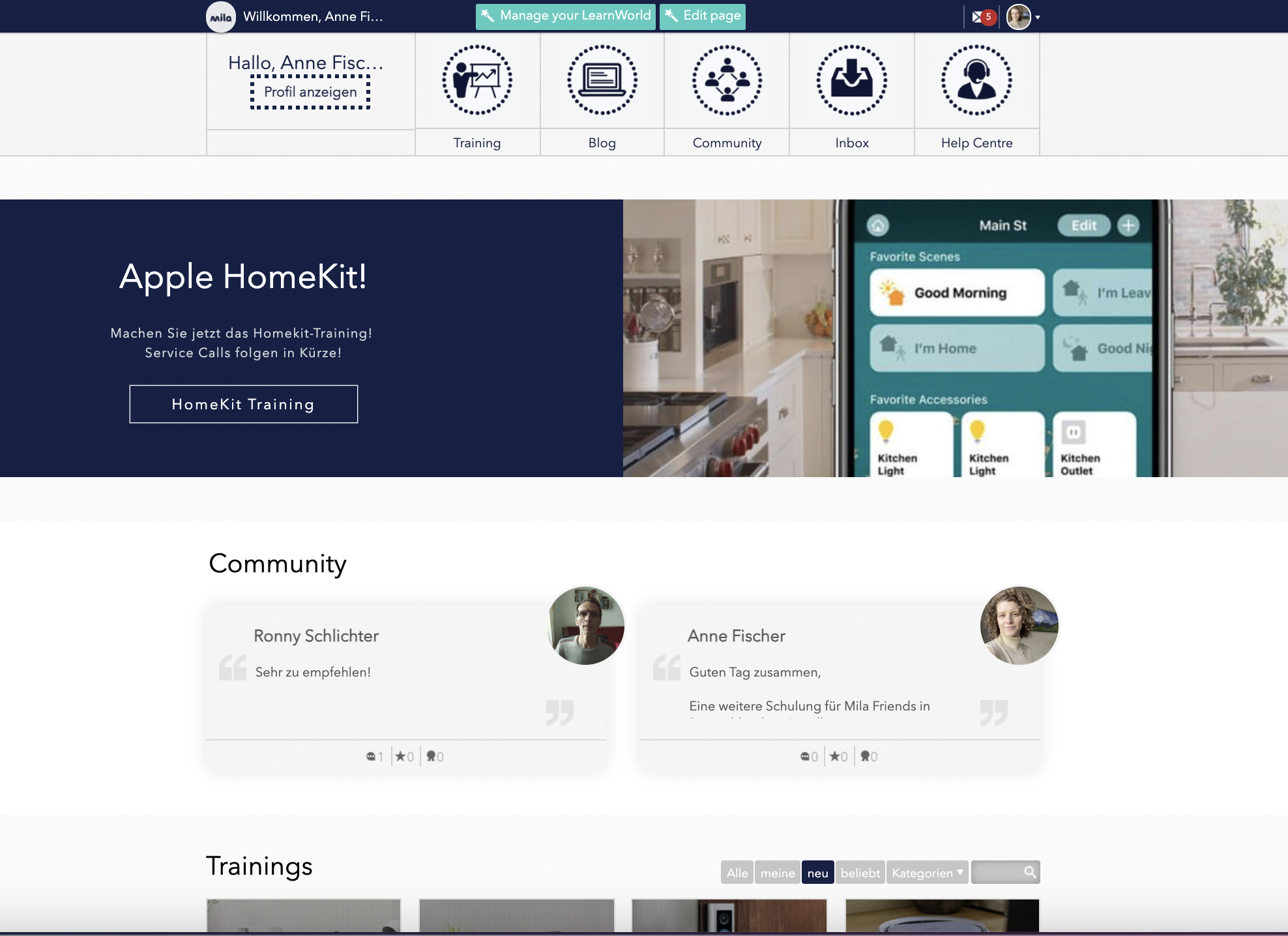
As a learning experience designer, I was hired to implement pedagogical best practices and e-learning design elements in our training for technicians. The LMS platform we used was LearnWorlds which for the most part, was pretty intuitive.
I was the sole learning designer at Mila and thus a lot of responsibility fell on my shoulders. In a nutshell, I was responsiblefor the design, development and management of e-learning content for all service partners in three languages- English, German and French. In addition, and to highlight my contributions to the role, I was involved in the following:
Conducting research and using its data to identify opportunities and areas of improvement on the training platform
Defining and impementing features on the LMS, leading to a more engaging learning experience
Creating videos and running an info channel for service partners
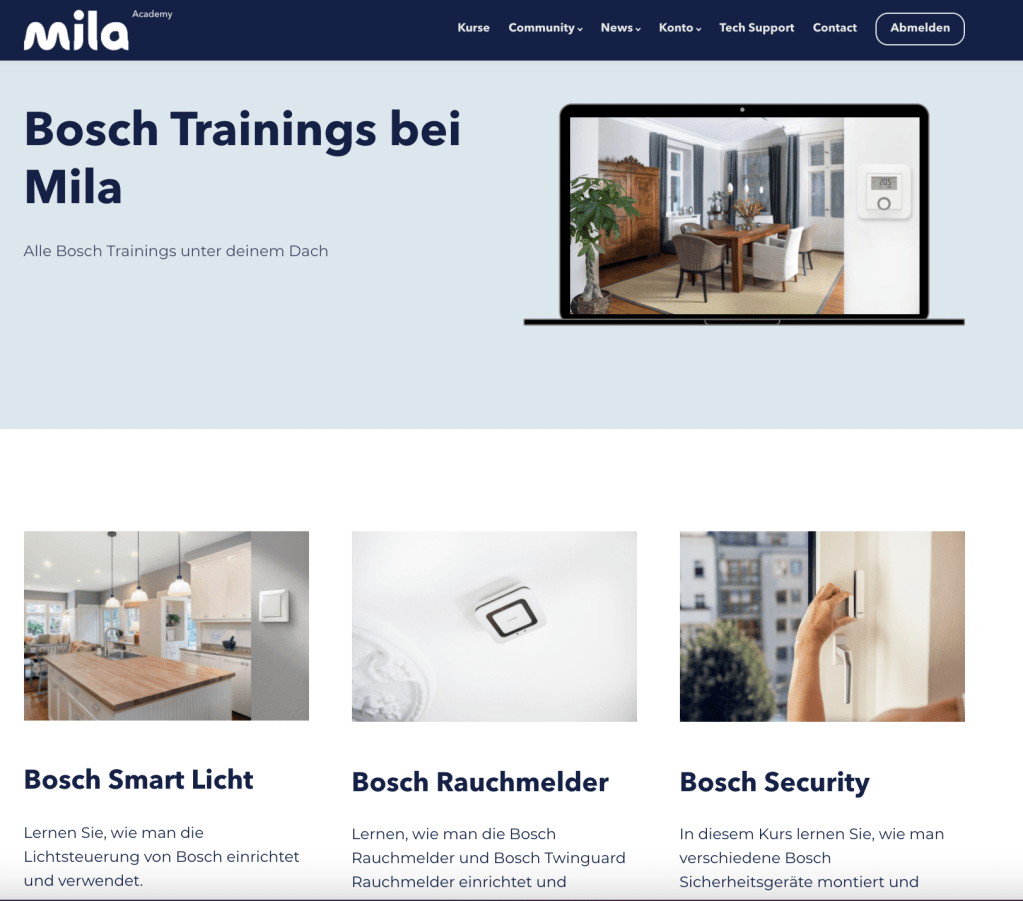
Project Highlight: Streamlining Trainings
At Mila, the focus was on creating a more sustainable and energy efficient world through the installation of smart home devices in private homes as well as businesses. However, in the rapidly evolving world of smart home technology, efficient and effective training is crucial for technicians who are on the front lines of installation. During my time as a Learning Designer at Mila, I was presented with the challenge of optimizing our training processes. Upon my arrival at Mila, the training platform had been a side job for other colleagues, I was the first person hired for the job and had a long list of to-dos in order to make the learning experience of the technicians better than it currently was. My journey was marked by a commitment to continuous improvement, leveraging research to pinpoint opportunities for enhancement, and implementing user-centered design principles to refine our Learning Management System (LMS), LearnWorlds.
Identifying Opportunites Through Research
The first step in transforming the LMS and creating a better learning experience was a thorough research phase. Creating user interview questions and conducing these with technicians helped identify crucial insights that shaped our strategy. This data was especially interesting as there seemed to be a difference in expectations of trainings and flow across different countries (we worked with Swiss, Germana and British technicians). Thus it wasn’t just about understanding the “what” of training but exploring the “why” behind the need for improvement. This approach helped in unveiling areas that required immediate attention and set the stage for a more tailored training experience that resonated with both technicians and customers.
Implementing Engaging LMS Features
With a clear understanding of our needs, I focused on enhancing the interactivity and engagement of our LMS. By defining and implementing new features, I transformed the learning experience from a mere transaction to an immersive journey. This included the creation of informative videos and the launch of an info channel dedicated to our service partners, establishing a dynamic platform for continuous learning and growth.
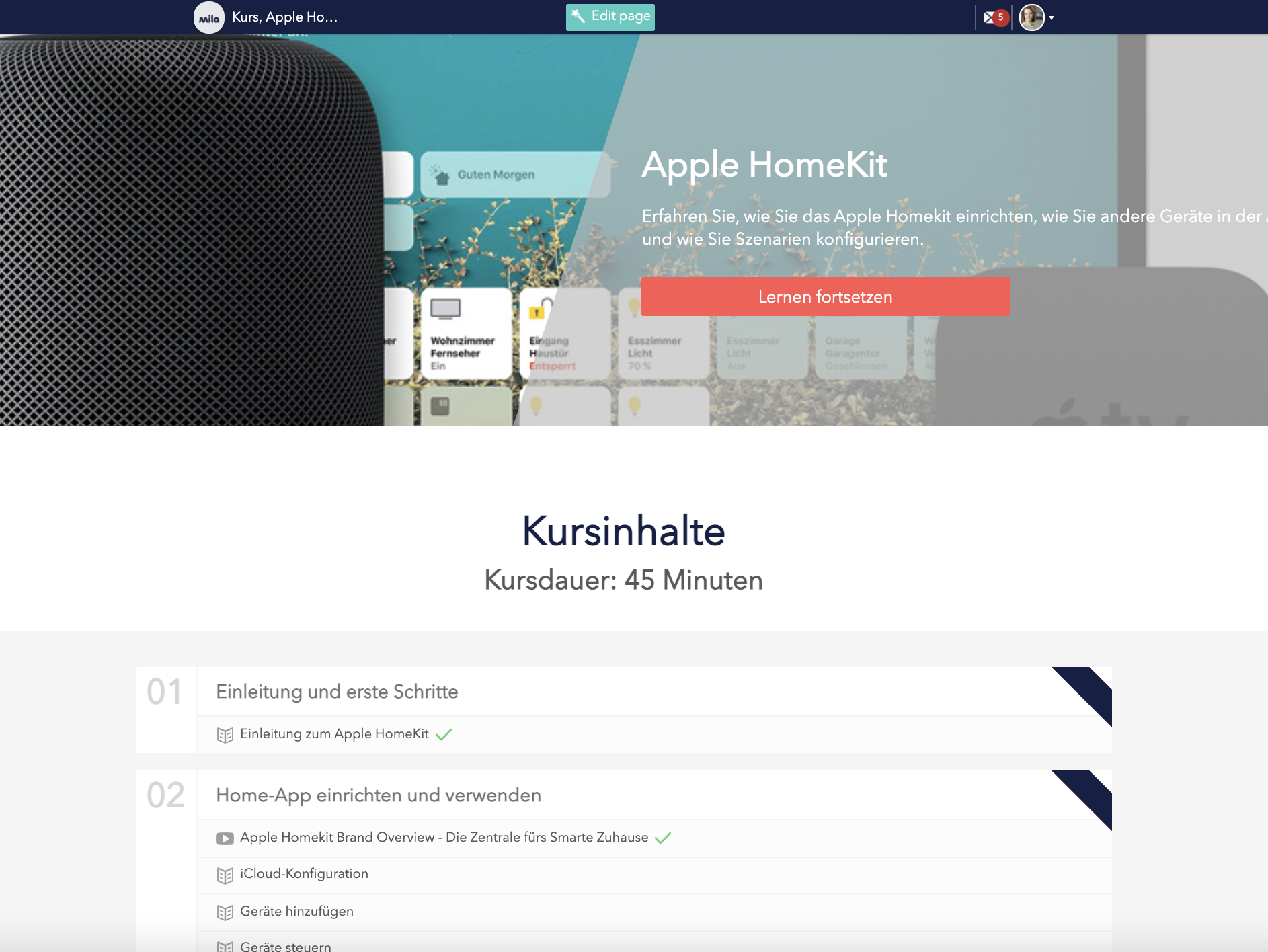
Streamlining Training with Bundled Courses
One of our key projects was the bundling of training courses by manufacturer, such as Bosch, Apple and Amazon. This strategic move was not just about organization; it was designed to expedite the upskilling process for technicians, enabling them to provide a broader spectrum of services. Consequently, customers benefited from reduced wait times for installations, and technicians could capitalize on the opportunity to broaden their expertise and service offerings.
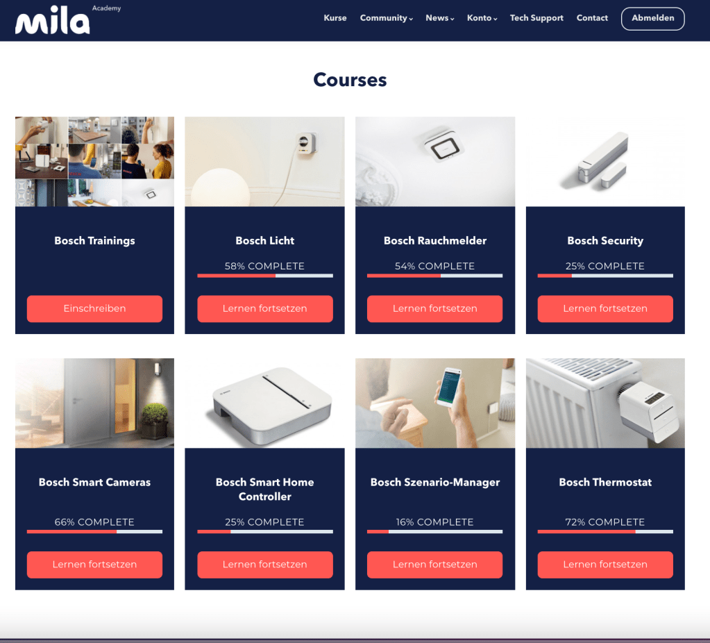
Revamping the User Interface
In tandem with course restructuring and in order to create a more consistent experience, I revamped the UI of LearnWorlds to mirror the aesthetic and usability of Mila’s home website. This visual alignment not only enhanced brand consistency but also provided a more intuitive and seamless navigation experience for users.
The results of these efforts was a streamlined, efficient, and user-friendly training platform that stood as a testament to the power of UX and design thinking methodologies. By engaging directly with both customers and technicians, I was able to identify needs, prototype effectively, and implement solutions that truly made a difference by not only improving the experience of the technicians but also driving business outcomes in the world of smart home services.
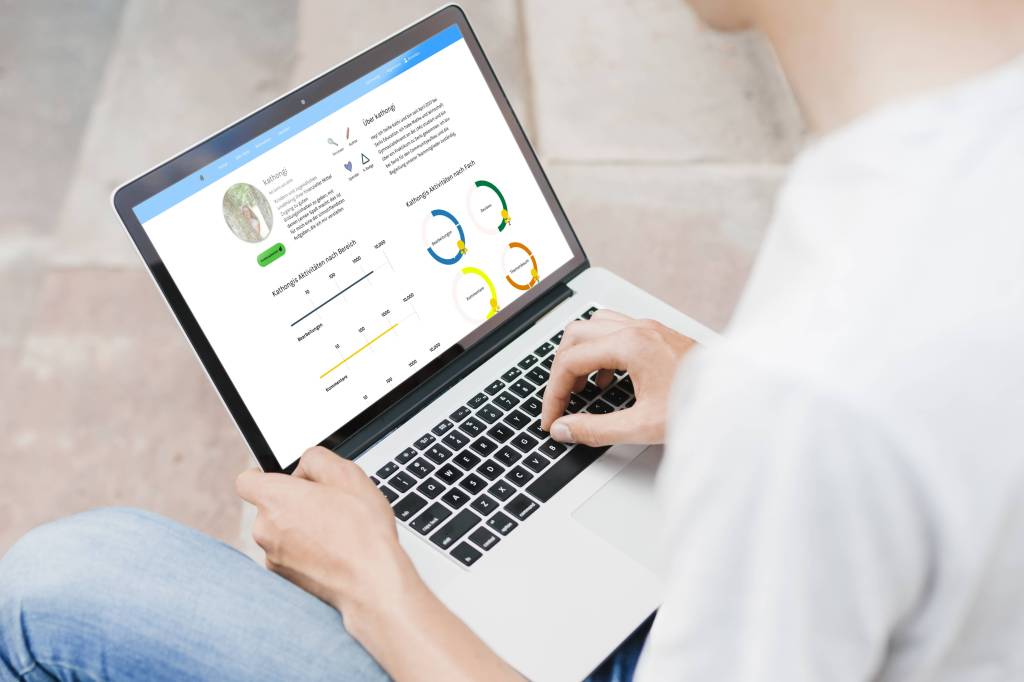
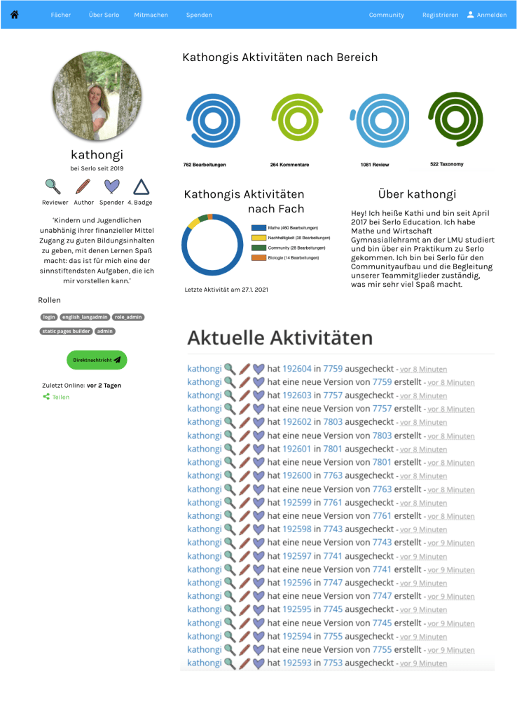
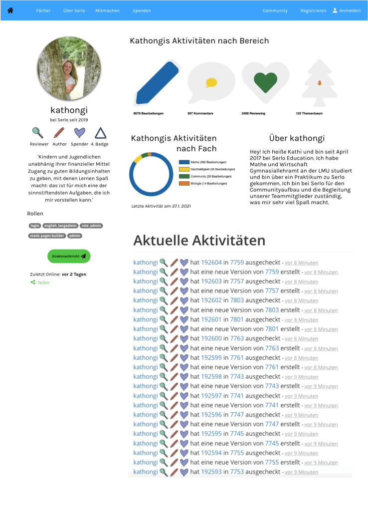
Serlo is a non-profit organisation that offers support, explanations, courses, videos, exercises and examples for students to support student learning in their own space and time. The learning content is created by highly-qualified teachers and professors. To date, over 1.25 million people per month use the platform. In order to create more transparency and to attract more attention from users, Serlo wanted to update their profile page and asked me to support with the UX and UI design of this project.
The Challenge
Being a non-profit organisation, Serlo has mainly worked in the past with volunteers who helped create the content for the learning platform as well as with volunteer programmers who helped to design and maintain the platform and website. As they rapidly grow, they are looking to attract more users to create content by awarding them with badges and gamification techniques. Additionally, they are looking to increase their donations quota. They hope to do this by creating a more streamlined profile page with which users can message each other as well as see the progress of their work and donations easier.
‘How might we re-design our profile page so that we may increase user content contribution, user donations as well as exchange between users?’
Setting The Criteria
Before I connected with Serlo, much of the user feedback had already been collected, thus it was more of a matter for me to take this feedback and to turn it into wireframes for both the mobile and desktop version. Criteria was set from two sides, from those of the users and those of the company.
User Criteria:
The ability to describe their motivations about working with Serlo.
To be able to connect quickly with others in the Serlo community.
To show the current projects they are working on in hopes of collaborating with other users.
To display which areas of the platform users are mostly active in.
Serlo’s Criteria:
Serlo wants to use gamification to increase attract more users and motivate existing users.
The introduction of badges was also seen as a high priority for Serlo in order to reward those who contribute to the learning platform as well as to increase the number of donators.
A simplified overview of a user’s profile page was deemed necessary in order to provide a cleaner view of a user’s progress.
Connecting with other users was also a necessary part of increasing user motivation.
Users should create a motivation sentence to help inspire their peers.
Creating Different Profile Layouts
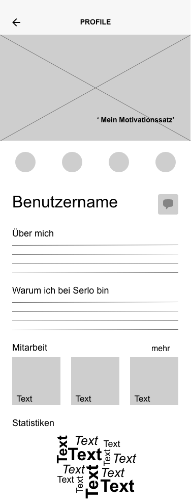
Now that the criteria was set, I was asked to create several different layouts of how these profile pages could look like. I opted for a mobile-first design (the desktop version was designed at a later date) in order to ensure that the clean, simplified overview that Serlo and its users desired would be able to be displayed in a clean and modern manner. This included understanding the spacing between objects and where elements such as buttons were to be displayed. For the mobile version, I decided to go for 6 columns, on the desktop 12. My breaking points for a responsive design were 375 px for the mobile and 992px for the desktop.
For the mobile versions, I originally created 4 versions in which the Serlo team and its users could then decide on what the best design could be. As the motivation sentence as well as the badges and messaging function were a big part of the upgrade, I initially focused on this. In the first version, however, there was still a lot of opportunity for text, something that Serlo users felt was necessary to have in order to describe their work. However, having so much text space really took away from the ability to make the page cleaner.
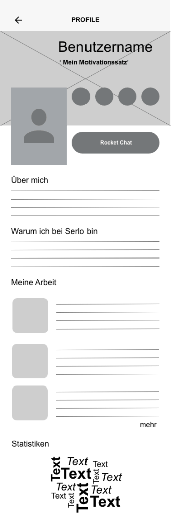
Version 1
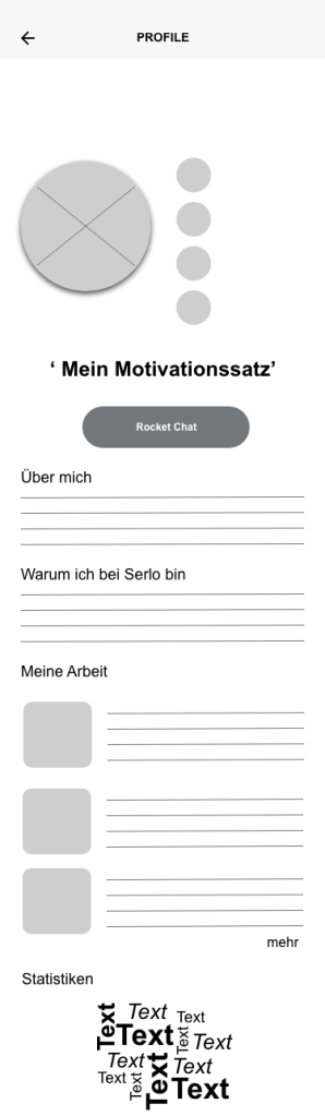
Version 2
Version 3
Version 4
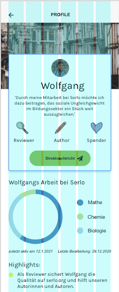
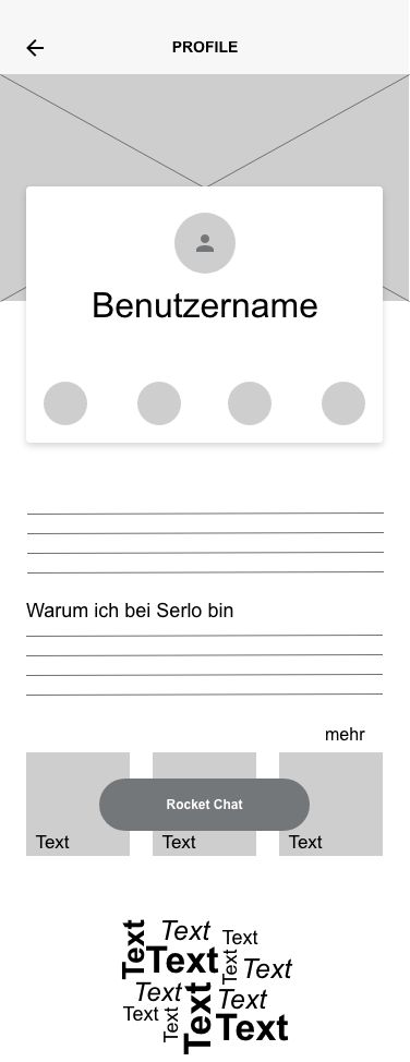
Feedback from users quickly showed that versions 2 and 4 were their preferred versions as they provided a cleaner look. Additionally, for the volunteer programmers it was an easier interface to program for and work with. After a few rounds of discussions and feedback, it was decided to further pursue the design of version number 4. Sticking with the Serlo colours, I experimented with placement of buttons and icons.
Desktop Version
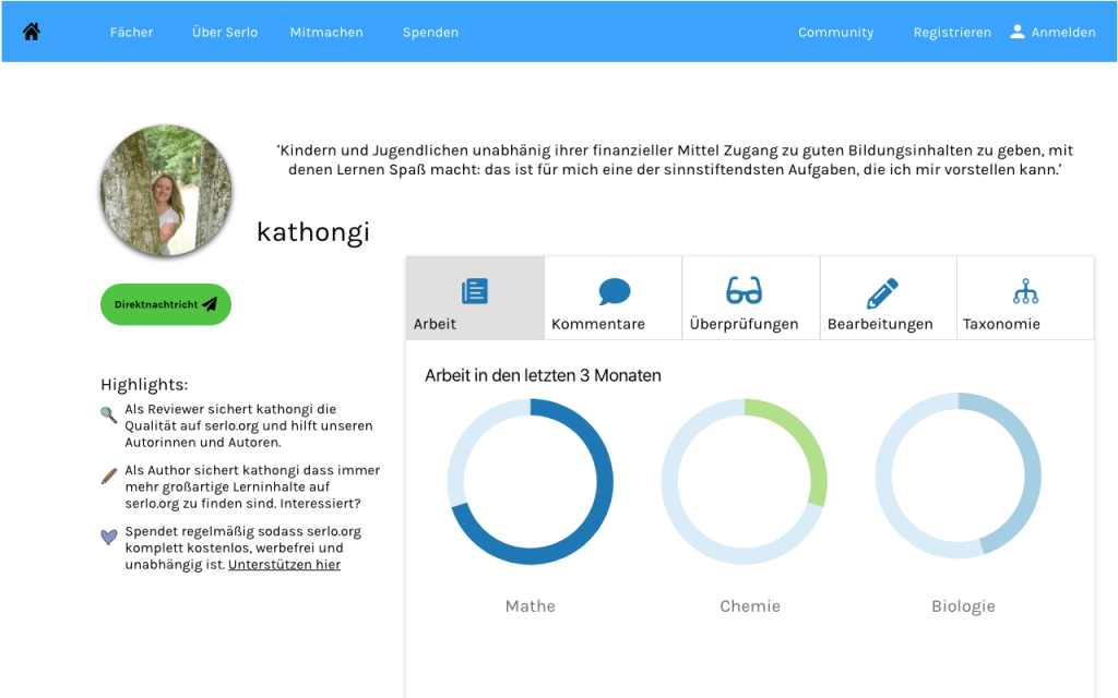
As Serlo users mostly work on the desktop, it was imperative to create a desktop version of the profile page. Once the ideas and concepts were laid out for the mobile version, I set to work on creating the desktop. One of my initial ideas was to make the information more compact by designing tabs for users to click on. This would avoid endless scrolling should a user need to find more specific information quickly. On the other hand, however, it does not offer users a quick and clean overview of some of their important criteria such as quickly overseeing the comments of fellow users.
While conducting feedback, users expressed that tabs were not very practical and aesthetically pleasing to them. Thus, I began to sketch out ways in which we could display user activity with a better overview. Some Serlo colleagues and I began discussing the use of shapes to display progression. We experimented with a few different shapes including circles, hexagons and icons as measurements for progress.
User Feedback and Final Versions
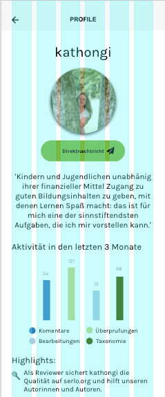
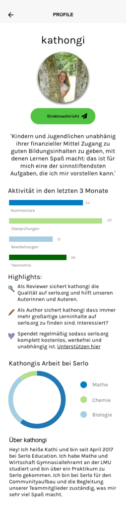
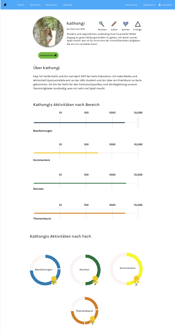
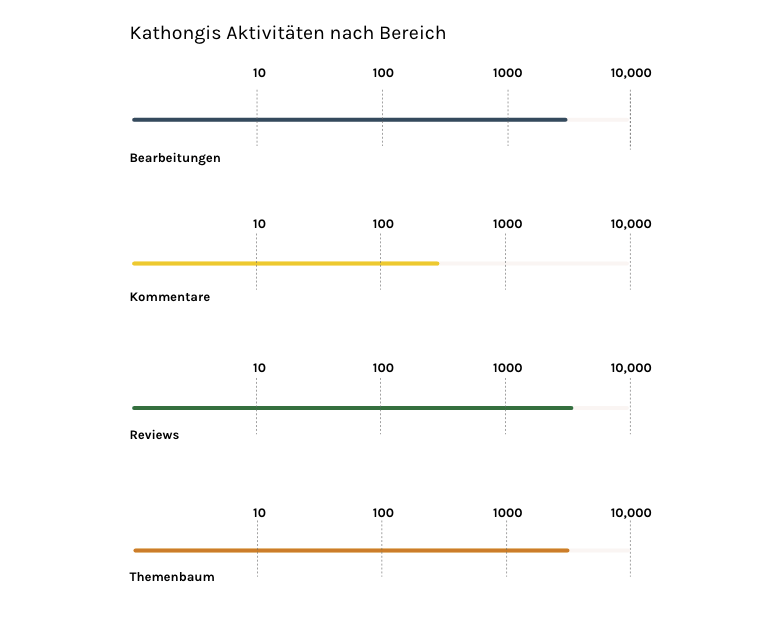
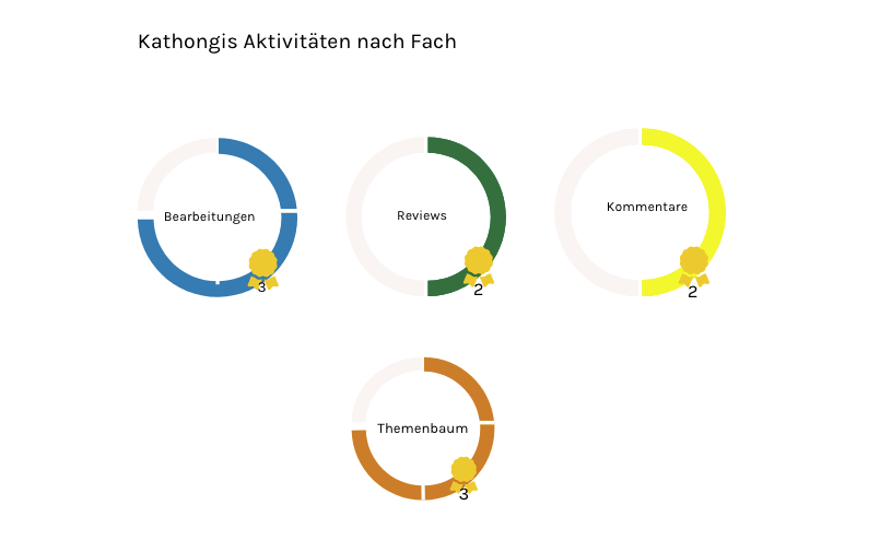
After sketching and wireframing several versions of the Serlo profile page, we received lots of feedback from multiple users and stakeholders regarding the layout. In the end, many users felt that too many circles or circular shapes could be confusing and not give as easily of an overview as thought. There was also suggestion to keep the shapes within one track instead of several. Many also wanted to be rewarded per stage of the work they had done. Extending the colour palette was also seen as a necessity as too many shades of blue and green could be misleading.
With this in mind, we created a more concrete version of the desktop and mobile page using a variety of colours and more simple, easily understandable progress measurements. To measure the progress of overall activity on the site, I used a progress measurement bar. For more detailed measurement of activity by subject, I went for a circular graph in which users were rewarded a ‘badge’ per level completed.
Reflection and Next Steps
As with many things UX, no work is ever finished :). My project with Serlo was a rewarding one; it was my first time working for a non-profit and the atmosphere of the team and the community was amazing. It was also one of the first times that I worked so closely with passionate users. On the one hand, it was a very positive experience to work with people who are so passionate about the product and the cause. On the other, it often proved challenging to introduce UX or UI best practices to them as they were sometimes reluctant to accept new ideas. In the end, we came up with a working model for the profile page but I am still working closely with the Serlo team to provide updates as needed.
As I continue this project, things that I would like to work on include making the badges more aesthetically appealing as well as to create a donations scale or badge (in the end, donations was not part of the first round of the profile page). Another challenge would be to design a ‘clever’ profile page to encourage those who are less active on the website to explain more about themselves and connect with others.
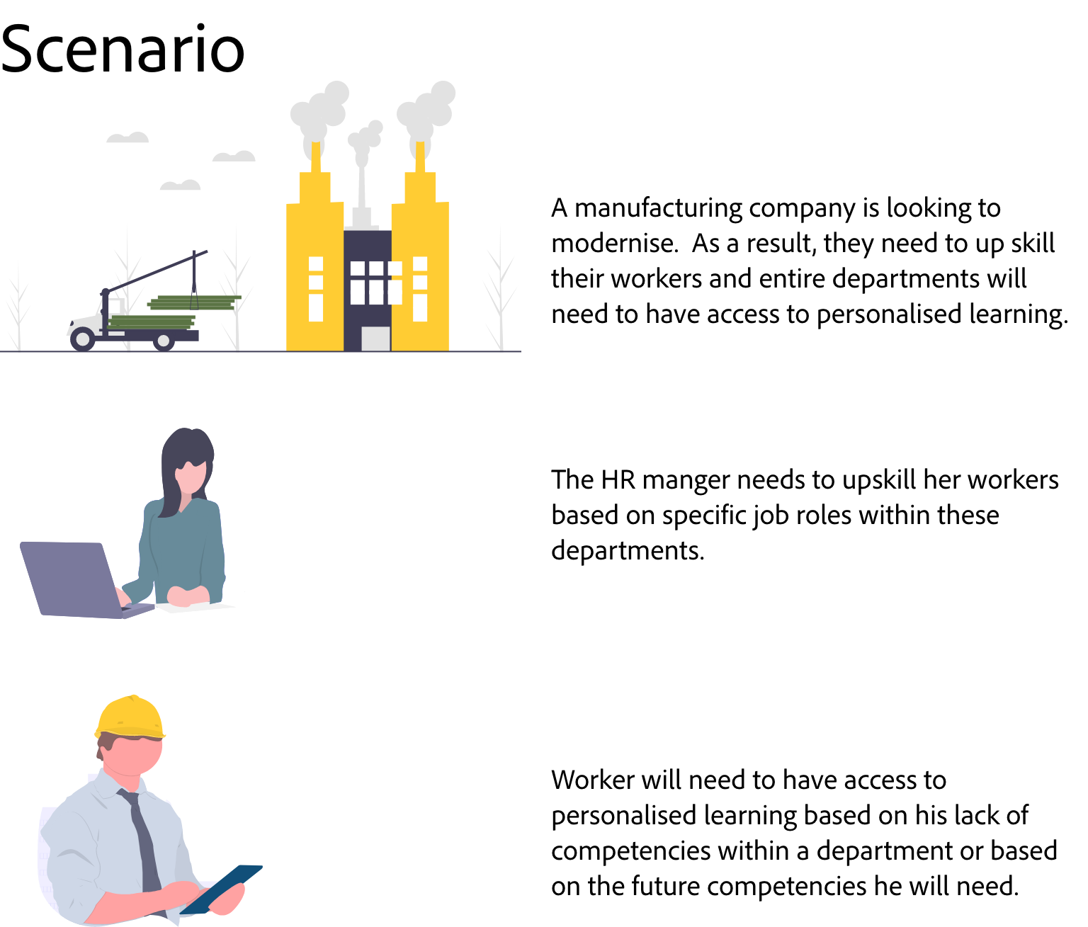
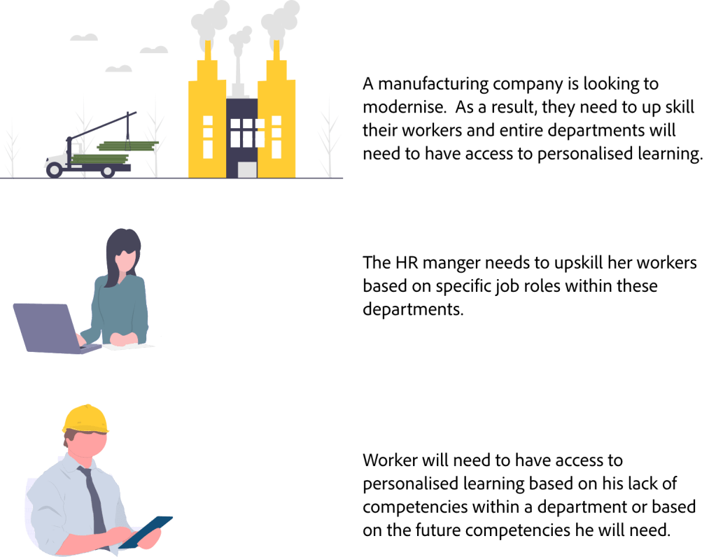
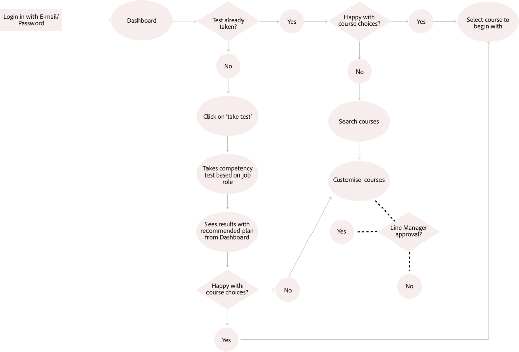
Recently, I had the opportunity to work with an early-stage Edtech startup who provides employee and company-wide trainings online. These trainings are, with the help of Artificial Intelligence and algorithms, highly personalised and fit to the specific skills that any one individual may need in a company, regardless of whether the entire department is also undergoing trainings as well. The company has rapidly grown in the past few months and now needs a way to relieve the burden of the onboarding process with line managers. Up until recently, the onboarding process was a combination between software and personal consultation. However, due to the volume of employees needing to be onboarding at once, they now need a more efficient way to handle this.
The Challenge
The current onboarding methodology of this company was a combination between workshops with line managers and a software program which helps match employees with personalised learning paths. However, due to the increase in the number of employees needing to be trained, they are in need of a way to onboard several hundred people at once.
Other factors contribute to the challenge. Many line managers are not sure about the soft skills of their workers; giving these skills a specific level is often hard to do. I was given the challenge of creating a persona and a user flow which would help alleviate the pain points of both line managers and whilst finding a way to assess the soft-skills of employees.
‘How might we design a better onboarding system, which will allows us to onboard multiple users at once while easing the burden of line managers in their quest to up-skill their workers‘
Getting Started
Before I begin with the challenge, let me give a bit of a background. The company that I was working with has only been in existence since summer of 2019 (that’s a year and a half from the time I am writing this). Companies that are early on in this stage of work have a lot more complexities than simply re-analysing their user flow. Thus, when designing the user flow, I also needed to dig into situations such as value proposition and business development. I absolutely love such challenges; working with a bigger picture helps to ensure that I can deliver a high quality product based on a plethora of information. Upon further discussion with the company, a value proposition was not something that they had very much focused on in the beginning. I took the liberty of creating one for this project which would help me deliver a more solid product. This was also shared with the company for their future use.
Value Proposition for EdTech Company
Another challenge of this project was that I was not simply given user interview information in order to make the flows. Many of the ideas of how the user flow (and thus to a certain extent the product and services being offered) needed to look like, was based off past experience and less so from user feedback. Although I was provided with a few user interviews, this part of the project proved particularly challenging to me in regards of who I was designing for.
Creating Scenarios
At this phase of the process, once I had gathered as much information as possible, I began to see that this task did not just involve one user flow, but several (including the HR employee, line manager, employee and the Edtech company itself). In the end, I decided to focus on two personas (more about that later). For now, I decided it was wise to create a scenario in order to help build a bit of a background for the personas and user flows as the user interviews section was coming up short.
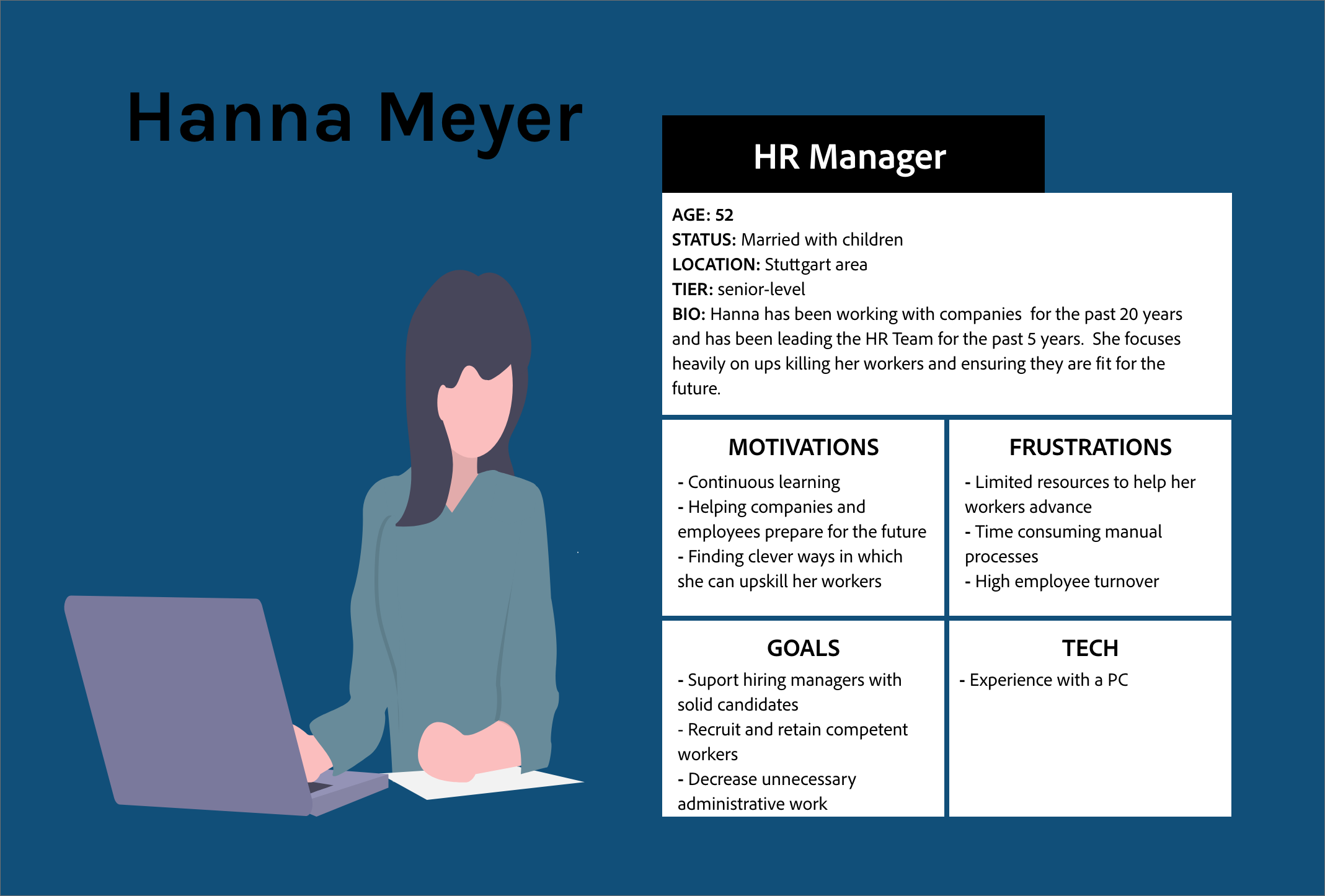
User Personas
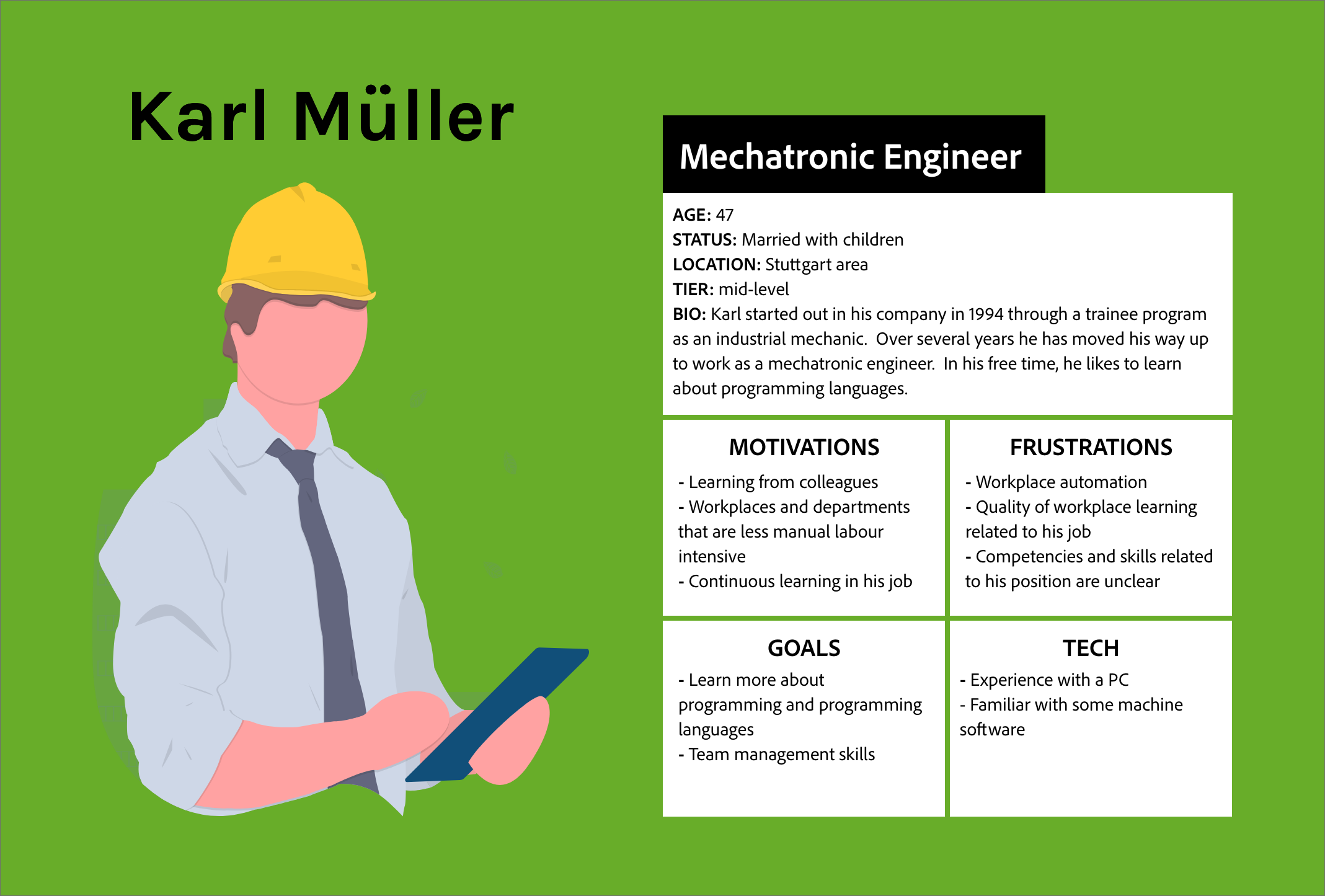
Based on given information of company background, value proposition, user interviews and the scenario, I was able to create two personas. Hanna is an HR manager and has been given the task of up-skilling entire departments in the manufacturing company she works for. Karl is a mechatronic engineer who needs to be up-skilled at work.
User Flows
Once the personas were identified, it was time for me to perfect the user flows. As this project had many complications with many scenarios that lead into one another, it was necessary to keep other flows (from the one I was working on) in the back of my mind.
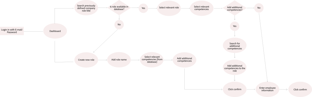
As much of the up front onboarding work landed on Hanna’s shoulders, I started with her user flow first. If a company is to onboard several dozen or hundreds of workers online at once, it is necessary for company X to save a collection of databases that can be referred to at a later point. Thus, I gave Hanna the possibility of searching for previously created role competencies or creating a new one.
Karl’s user flow begins where Hanna’s ends. Instead of Hanna guessing the competencies of her workers, her workers are given a competency test to take themselves, thus relieving the burden of the HR manager. By assessing the competencies of workers individually by the workers themselves, the software used to generate personalised learning paths becomes more targeted.
Looking Ahead
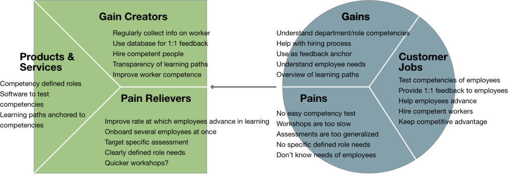
Identifying user personas and mapping user flows helps to identify the next areas of opportunities. In order to make the onboarding process run as smooth as possible, and to successfully identify worker competencies, a software to test competencies and skills needs to be identified. Once this is created, it can be pushed out to workers to identify gaps in their skills. Additionally, it can be used as a tool for line managers to use in 1:1 meetings and in creating job descriptions.
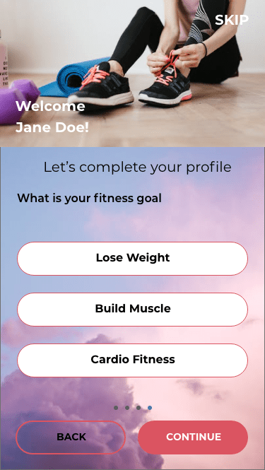
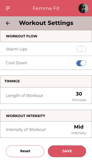
Problem: How might we motivate women who lead busy yet sedentary lifestyles into an exercise routine that is personalised, inspiring and rewarding for them?
Solution: Create a responsive web app that allows for users to create personalised exercise routines that are integrated into their daily schedule.
Role: UI Designer
Project Timeline: 5 weeks
Primary Stakeholder: Career Foundry UI Course
Tools Used:
Adobe XD
Figma
Sketch
Photoshop
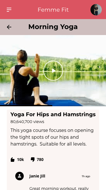
There are quite a few workout apps available on the market these days making it hard for users to understand which app is right for them. Many fitness apps focus on specific regions of the body or a specific type of workout. With many promises of ‘getting fit’ in a short amount of time, it is hard to know which one to choose. In this sense, it is easy to become overwhelmed when deciding on an app to help get you in shape.
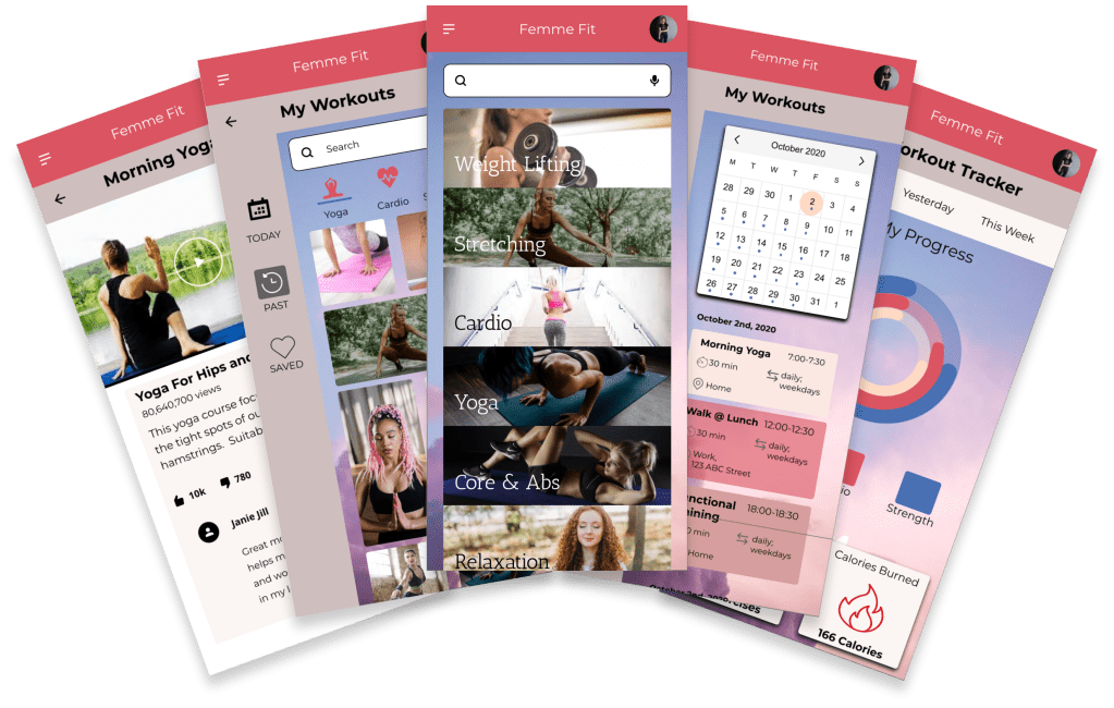
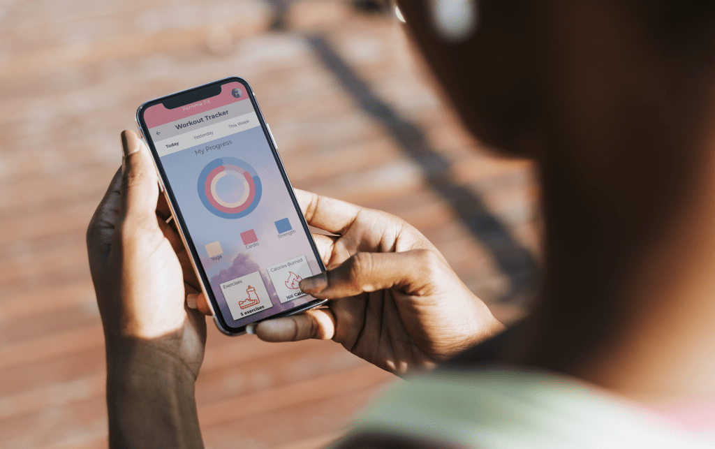
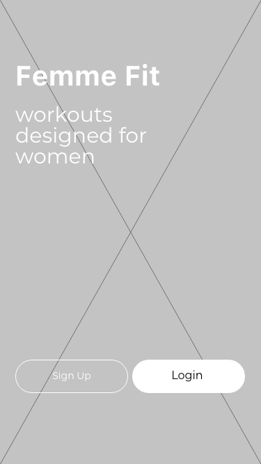
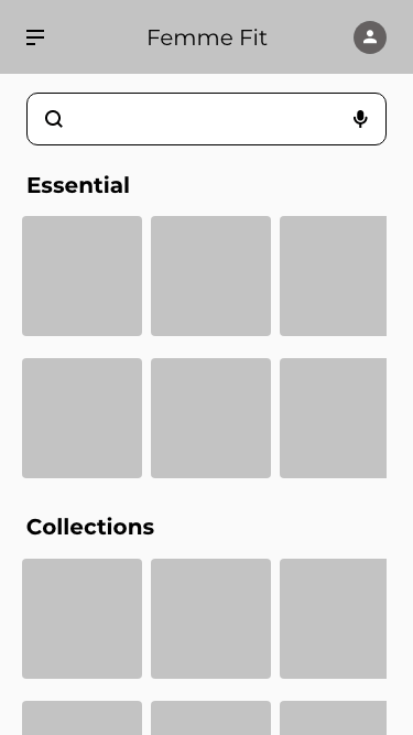
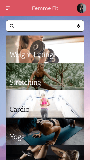
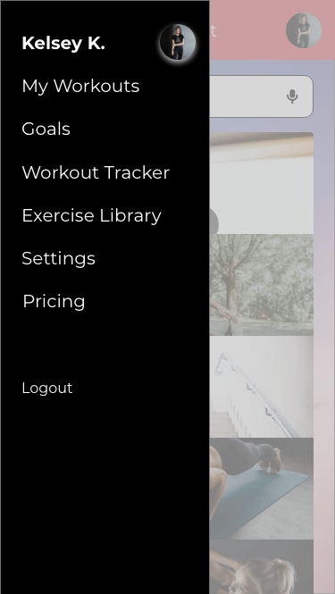
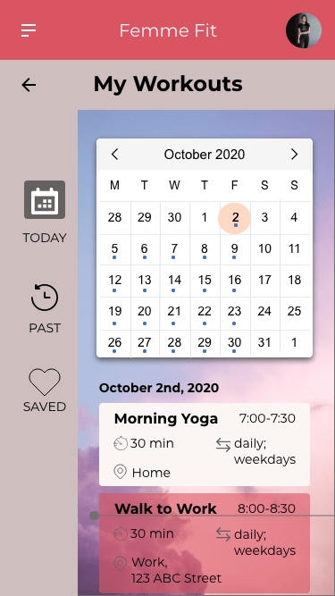
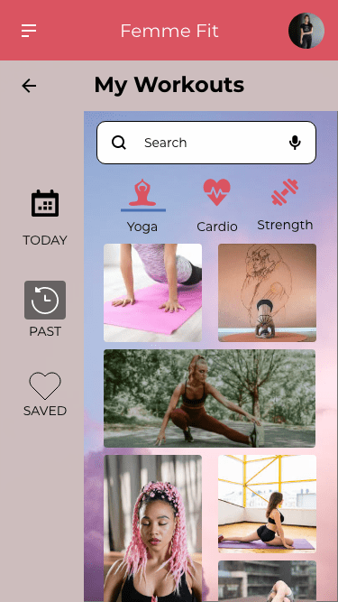
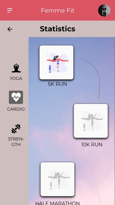
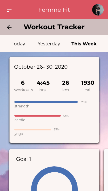
With so many apps out there, I decided to focus on a specific market; namely busy women who are looking to stay in shape in a realistic way that fits their personalised lifestyle. Femme Fit is designed to inspire, motivate and empower women into getting into shape through criteria which they set for themselves. This UI project was part of a user interface immersion project that I completed alongside my UX training. The goal of the project was to get familiar with specific UI principles, patterns and heuristics with the end result of creating a responsive app with hierarchy, colour, typography and iconography. The project took one month from mid-October to mid-November 2020.
Approach
After reading the project brief and analysing similar workout apps, it seemed many of them required an immense amount of work upfront including registration and payment before the user could get started. In order to hook a user and keep them signed up, apps need to be easy to use and require minimal effort to change workout preferences. With this in mind, I gathered a list of patterns I wanted to add to the Femme Fit app.
Adjusting sessions through AI- users would be asked for a quick like/dislike feedback after each session to determine what type of workout they like best.
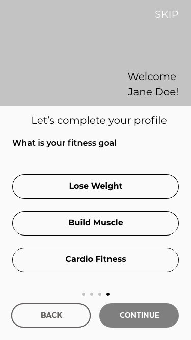
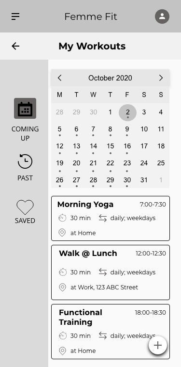
Walkthrough– The user will get a sense of what the app does and how it can help them achieve their goals.
Notifications– Users will be notified as to what is coming up in their routine and will have the ability to adjust the timings based on their schedule.
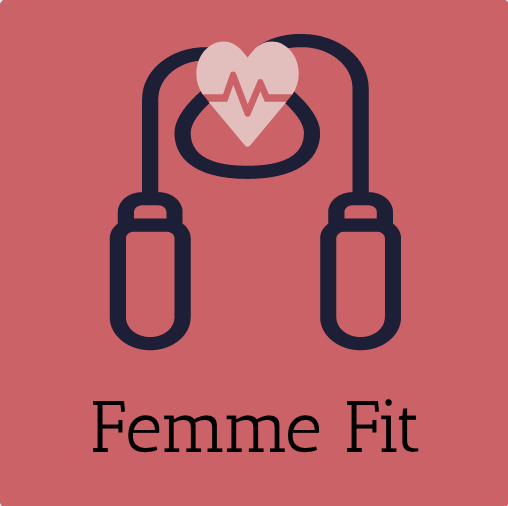
Logo Design
The logo design went through several versions, all surrounding the theme of fitness and femininity. The first logo with the weight seemed too harsh and also did not concentrate on the overall well being. The second logo with the jump rope outlines ideas of fitness and health when combined with the heart. The final logo emphasises the heart.
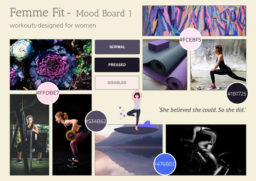
Mood Boards for Visual Direction
Style Guide
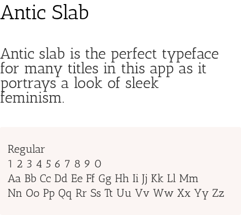
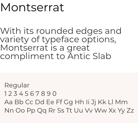
The style guide of Femme Fit reflect the apps goals of motivating , inspiring and empowering women in their workout routine. Thick and think fonts provide a combination between soft and strong while real photos of women working out are meant to provide a realistic approach to fitness.
A balanced colour palette and customised icons give Femme Fit a distinctive feel and personality. However, these are not the only features adding to the app’s unique personality. The complete style guide can be found here.
Colour Palette
Typography
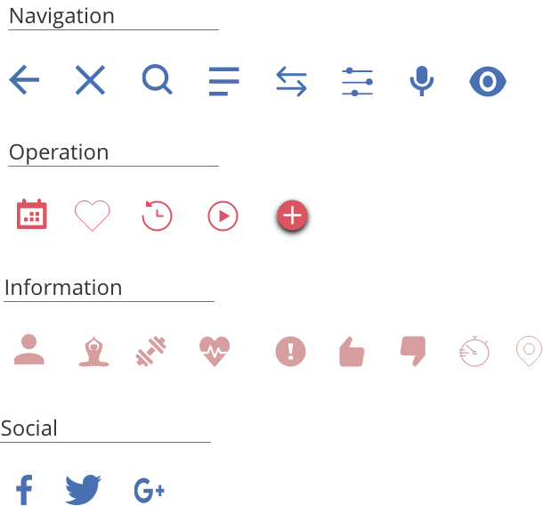
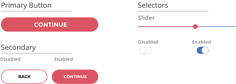
Icons
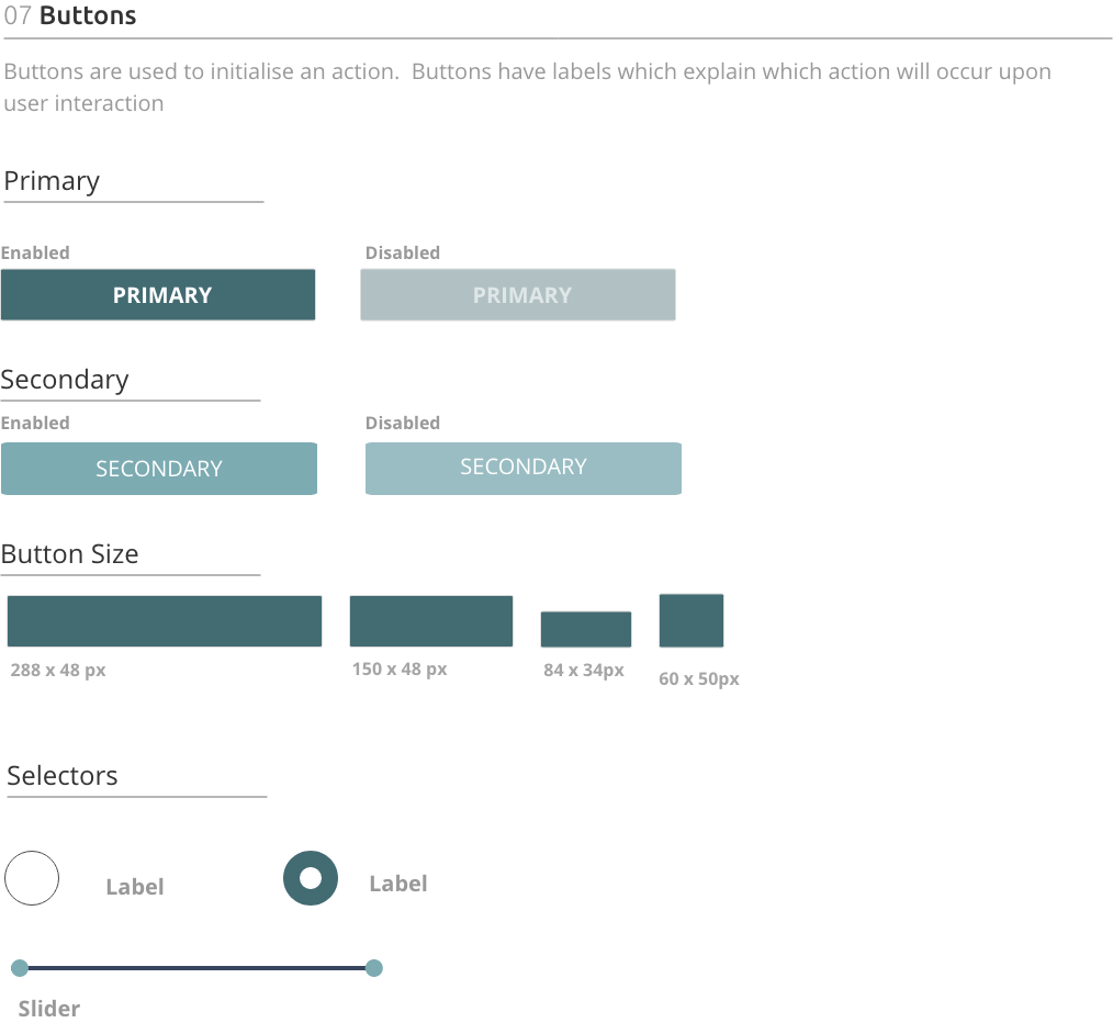
Buttons
Responsive Design
Responsive design was one of the most challenging aspects I learned about in this UI project. As I did not have any developers to consult with on this project, I needed to consider a few important aspects such as layout, navigation and media patterns before deciding what my breakpoints would be. In the end, I went for a 375px breakpoint for mobile, 768px breakpoint for tablet, and 992px breakpoint for desktop.
This was my first comprehensive project in UI design. My intention was to design an app that was practical to use on a daily basis combined with aesthetics that both inspire, motivate and empower women to get and stay in shape in a way that works for them. My biggest learning curve was in the responsive design, especially when designing for wider screens, deciding on what breakpoints would be best and where to place images.
Moving forward, I would add features to track habits of where and when users feel most motivated to work out. This would be in addition to designing a feature where users can connect to work out with friends. Something to gamify the features to keep users motivated would be big plus perhaps in connection with a bonus program from a local health insurance.
Looking to the design, I would want to create a dashboard to display at a glance personalised information on one screen instead of the several I designed.
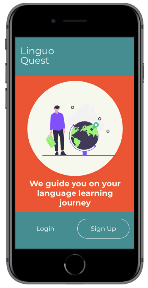
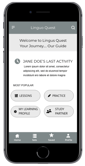
An app that guides users on their language learning journey
Objective
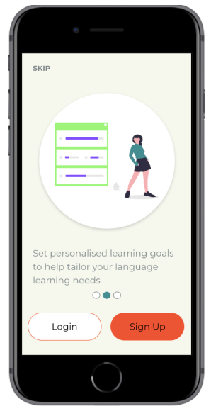
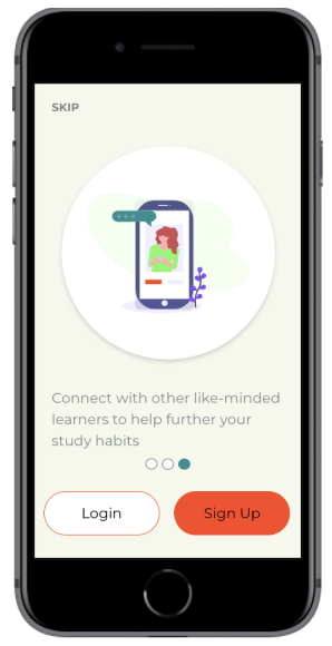
As the world gets smaller, the need to learn foreign languages grows. Despite this growing trend, the way in which people learn languages is such a personalised journey influenced by many factors including language difficulties, learning abilities, and personal motivation. I created Linguo Quest, an immersive, personalised language learning app that teaches people words and context and how to use them in everyday life. The goal of this app is to build vocabulary thus increasing fluency in a language.
My Role and Workflow
My Role: UX/UI Designer
Project Duration: April, 2020
Tools: Marvel, Adobe XD, Figma
Setting The Scene….
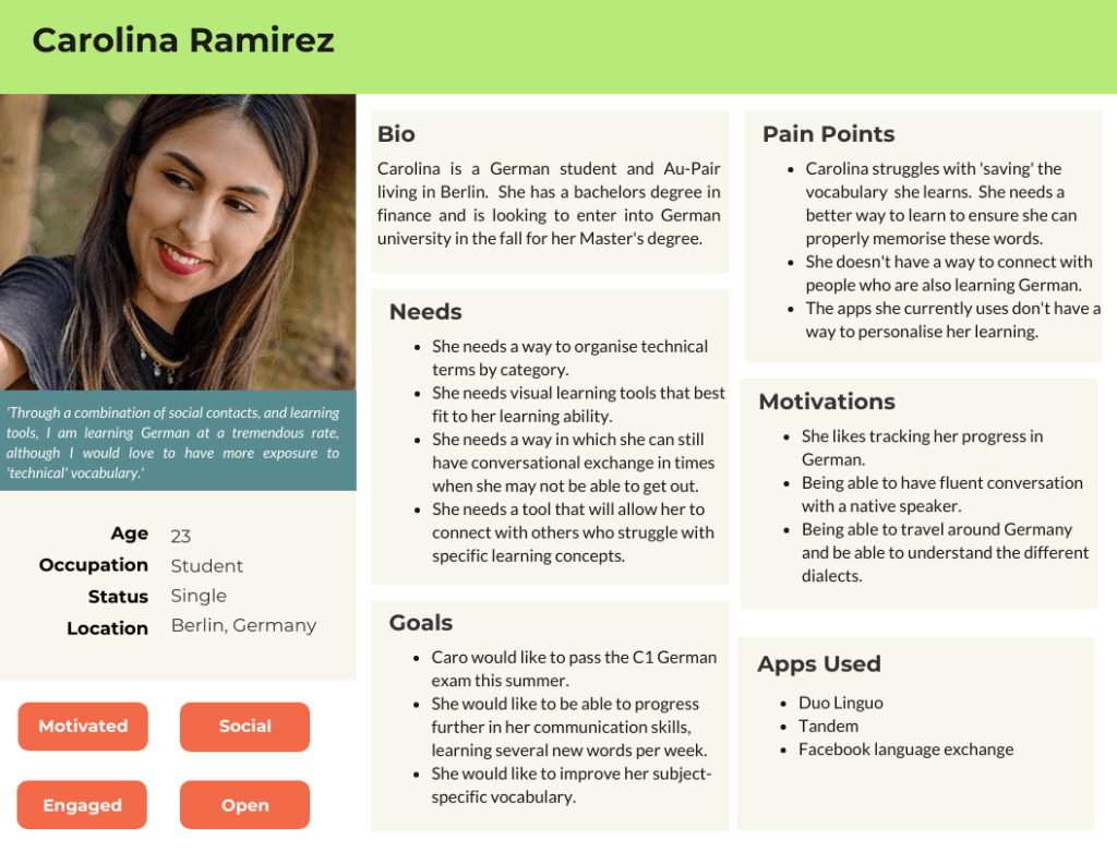
Carolina is a 23 year old Female from Colombia who has recently moved to Germany. Her goal is to master the German language to eventually study at a University in a major German city. In addition to studying and in order to immerse herself into the language and culture, she works as an Au-Pair in Berlin.
She is excited but also nervous as her university acceptance is riding on the fact that she can master the German language. She needs a way to master her vocabulary in order to pass the test. Connecting with other language learners is also an advantage for her.
‘Simply memorising words doesn’t work for me. I need more visuals, more input’
Carolina during her user interview
The Problem
Carolina has recently moved to Germany to learn the language and to study for a university entrance exam. How can she best build her vocabulary and connect with others? She needs a platform that can deliver her streamlined and concise language practice as well as help her connect with friends. Until now, she has not found a way to combine both possibilities in one app.
Hypothesis
We believe, that by building an app that allows for users to organise subject specific words by category as well as allow her to connect with other language learners, we will achieve Caro’s goal of personalising her learning.
The Solution
At Linguo Quest, users will be able to study a language through a variety of engaging learning practices that fit the learning abilities of each user. Not only will users be able to measure their progress, but they will also be able to set personalised learning achievements that ensure they reach their desired goals.
Linguo Quest also serves user needs by allowing them to connect with other language learners. This helps them strengthen their vocabulary in addition to finding a community which they can rely on.
Understanding The Problem
Competitive Analysis
In order to understand how I can best serve the needs of my users, I first conducted a competitive analysis. I analysed three language learning apps- Drops, Vocabulary Builder by Magoosh and Quizlet. Here are some key takeaways from my competitive analysis.
Drops
Pros
14+ vocabulary sections with various levels for each section
Infographics for each vocabulary word help visual users
Variety of games and activities within each set
Advanced statistics of user progress
Immediate feedback on correct and incorrect words
Cons
Users are only allowed to practice 5 minutes every 10 hours on the free version.
Lots of distractions and advertisements to be a pro user
There is no where to mark or ‘star’ a particular word
There is no ability to customise sets
Vocabulary Builder By Magoosh
Pros
Progress bar shows duration of set
Words on flashcards are clearly defined and well positioned
Users get immediate feedback and detailed definition on each word they try
Possibility of playing online with others
Cons
Sections must be completed in order. Could come as a frustration for users looking for more of a challenge.
Audio button only available in the word definition explanation. Users can only hear native pronunciation after they attempt the word
There is no where to mark or ‘star’ a particular word
Quizlet
Pros
Ability to share set and app with others
Audio button to hear native pronunciation
Variety of activities focused on different learning styles
Customisable flashcard groups for preferred words
Variety of question types during test
Cons
New study sets can only be added through the search page and not the home page.
Quizlet live game can only be played with a code from teacher. There is no ability to play with others online if you are studying by yourself.
Advertisements contain pictures. This could confuse the user when they are using study sets with visual aids.a
User Interviews
I conducted three user interviews with people who are currently language learning students and who currently use language learning apps to help their studies. The individuals were all aged 23-27 and lived in Berlin.
Key Findings
Users needed an app that combined vocabulary learning with listening skills. This would help them hear how to pronounce the words easier.
There was a need for users to be able to study vocabulary sets with other language learners. This was seen as a great way to connect with others while also learning a new language.
They need an app that can be used easily on the go, no matter what situation they are in.
Thinking
I think apps can help you stay connected when learning language
I think language learning apps should be free or should have more exercises in them
I think we can learn effective ways of communicating by building our vocabulary
Feeling
Deciding what topics to study helps me feel more motivated to learn
I feel frustrated when apps do not offer me enough exercises to practice with
I feel frustrated when I can’t remember previously learned vocabulary
Doing
I like to practice my vocabulary by talking with others
I like to use apps on the go for review. I like to be able to study anytime and anywhere
I like to use a variety of study methods when learning a language, especially for vocabulary
Ideating Solutions
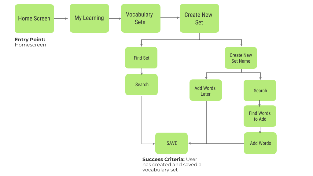
User Flow 1- Create a personalised vocabulary set
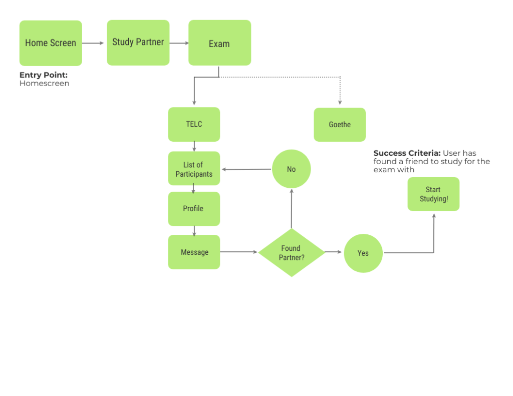
Flow 2- Connect to Other Exam Learners
Prototyping & Usability Testing
Once it was established who we were designing for and what their journey would be, it was time to start prototyping. I initially started off with low-fidelity wireframes surrounding these tasks. I designed three tasks for my users:
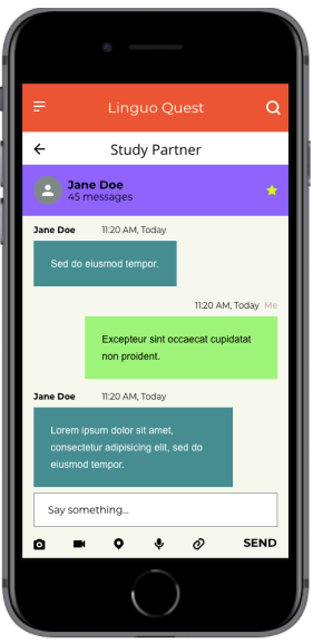
Practice your personalised vocabulary set ‘travel’.
You would like to connect with a study partner to help you prepare for your exam.
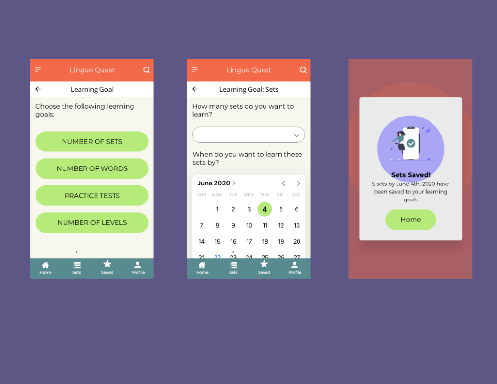
Set a new learning goal for yourself.
As this was a rapid prototyping and iteration exercise, usability testing was done with low- and mid-fidelity wireframes using the Prototyping on Paper app from Marvel.
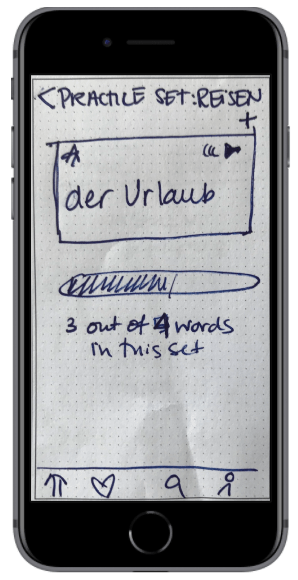
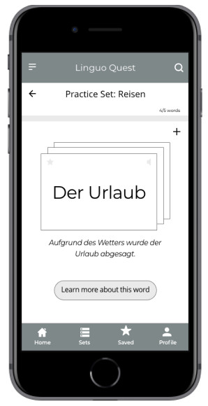
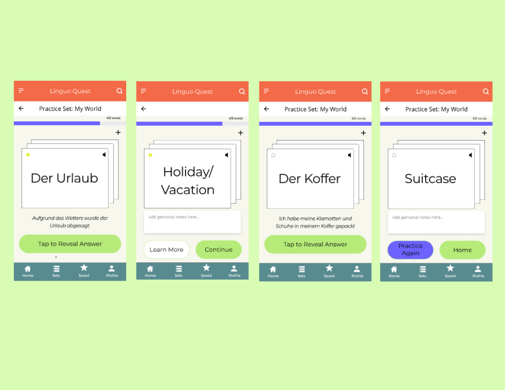
Practice a Personalised Vocabulary Set
Here, users encountered a variety of obstacles in when trying to practice their vocabulary set. Some users wanted more details and examples of the words while others did not understand how the flashcards flipped. Furthermore, the progress bar location confused the users. Here, I created an option for users to learn more about a particular word, moved the progress bar to the top as well as re-designed the flashcards to help users understand how to use them.
LOW TO MID FIDELITY WIREFRAMES- Practice Vocabulary Set
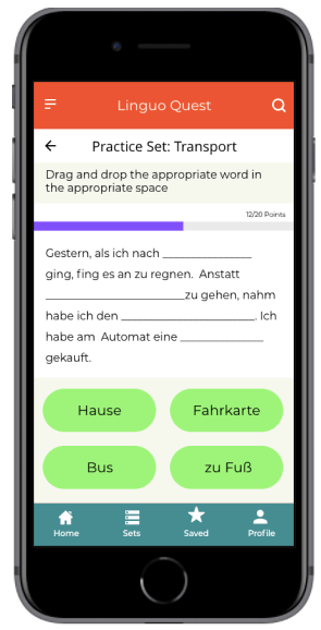
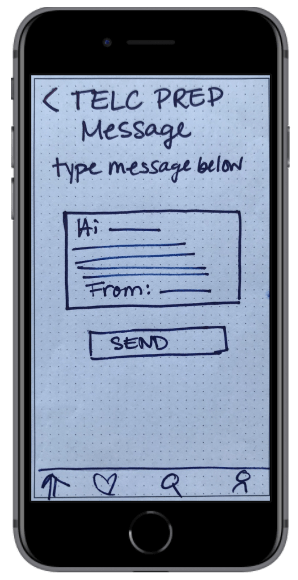
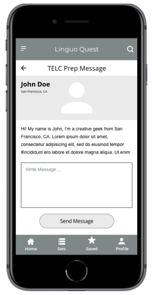
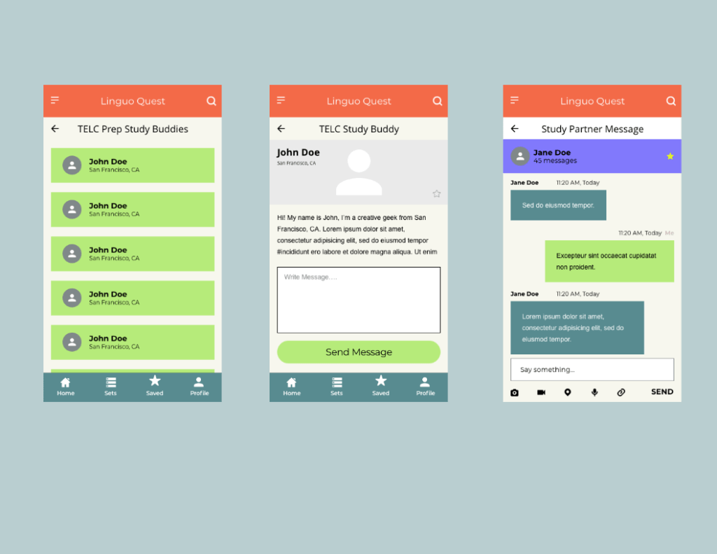
Connecting With a Study Partner
During the usability testing, all participants were frustrated with the fact that they could not get any detailed information about the person they would study with. In the mid-fidelity version, I allowed for the user profiles to be visible as well as added a chat function so that users can have more transparency with whom they are studying and be less frustrated by connecting with a partner that suits their needs.
LOW TO MID-FIDELITY WIREFRAMES- Connect With a Study Partner
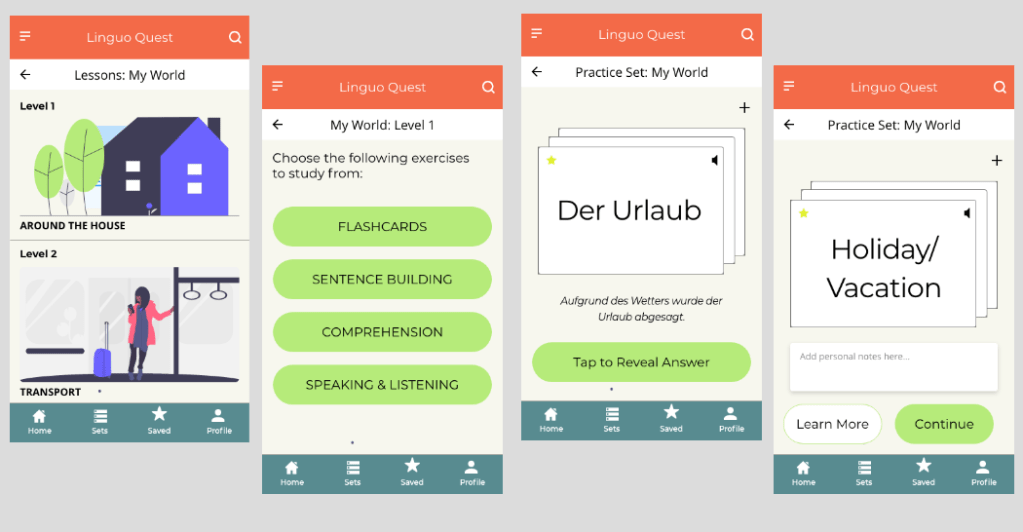
Set a New Learning Goal Date
The users who do not have English as their native language were often confused as to where to go to create a personalised learning set. I added icons to help guide users understand the meaning. Here I stuck to known symbols, making the design more universally acceptable.
LOW TO MID-FIDELITY WIREFRAMES- Set a Learning Goal Date
Design
Retrospective
What went well?
Overall, despite the rapid tine frame in which this project was completed combined with the fact that the usability testing was conducted with paper prototypes, I am please with how things turned out. The feedback from users provided useful insight for my mid-fidelity wireframes and also gave me a good insight into the world of user behaviour and needs.
As this was my first ever prototype, I am pleased with how the layout and the color combination looks- there was definitely a big learning curve for me when it came to understanding UI elements!
What Could Be Better?
As this was my first ever project, I wasn’t sure what to expect when it came to usability testing. Thus, my scenarios and tasks came out confusing to some. This combined with the paper prototypes got the test off to a rocky start for some. Next time I will think about the scenarios and tasks in more detail, describing them in a way in which all language levels can understand.
What’s Next?
Looking ahead, I would like to build a full-fledged high-fidelity prototype for this app and continue with another round of usability testing. I would also like to focus on designing for accessibility and making the app more friendly to those who have language learning difficulties.
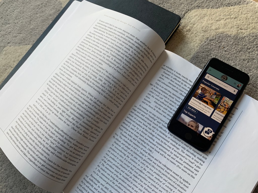
An app that provides reliable, professional development and expert advice for a changing educational world
Eduteach is a responsive web app that allows educators to instantly connect with an expert, get advice on the latest education topics, partake in professional development courses and connect with other teachers globally.
The idea for this project came from the foundations of an assignment I was given in my UX certification course. Although I was provided the outline, I had considerable flexibility to adapt the concept and design. My initial idea focused on connecting experts with industry experts; in the end I added two other features to the product based on my research (see below). Firstly, I wanted to attract teachers who are keen to partake in professional development courses online. Secondly, connecting globally with other educators was seen as a necessary feature for this app. Finally, as this was a responsive web design, I wanted to focus on a mobile first approach.
‘To provide future generations with top-quality education, teachers need to find a way to stay ahead of the curve in an ever-changing world.’
My Role and Workflow
My Role: UX/UI Designer
Project Duration: April- September, 2020
Tools: Adobe XD, Figma, Sketch, InVision
The objective of the course project was to design a simple and intuitive way for users to connect with an expert within a particular field. The app is designed to be used for free, however, a payment would be required for calls done over the platform. I was solely responsible for concept and design until handing off the project to developers. I used the design thinking methodology as an outline to guide my project. This project was done on a 20-30 hour per week basis alongside a full-time job.
01
Research
Competitive Analysis, User Interviews and Surveys
02
Define
Affinity mapping, creating personas, user journey and task flow
03
Design
Sitemapping, wireframing, hi-fidelity prototyping, visual design and language guide
04
Test
Usability testing, preference testing, peer review and design collaboration
The Challenge
The world is changing at a rapid pace, yet education, testing and teaching methodologies have remained largely unchanged in the past 150 years. Under pressure from the government and institutions to prepare students for the 21st century, teachers are left feeling frustrated, under a lot of pressure and burnt out over the variety of tasks they need to achieve in order to further student success. Teachers are keen on developing themselves professionally, but feel challenged by taking time out of school to attend workshops and often feel disappointed by a ‘one-size fits all’ approach to professional development.
The challenge was in creating a product that would connect educators with the latest education topics which supports their professional development by connecting them with industry leaders and courses that support them on their professional journey.
‘How might we provide educators with a more personalised and authentic professional development experience?’
Competitive Analysis
To understand the market and identify existing offerings and highlight possible problems, I conducted a competitive analysis. At the time of research, my competitive analysis showed that there were very few direct competitors allowing teachers to connect with a pool of experts and undertake online courses with them. The number of indirect competitors, such as coaching websites, was larger yet they did not specifically target educators nor did these competitors have a focus on the education market. I focused on EdSpace and Coach.me for a more in-depth analysis.
Using the SWOT analysis, I decided that there was more opportunity in the market for the app I was designing. In this context, differentiation with my app is key, especially in regards to connecting with the community, personalised professional development and re-licensing certification.
EdSpace
Strengths
Peer-to-peer professional development
Available worldwide
Self-paced learning
Free app upon sign in
Simple value proposition
Internal Messaging
Weaknesses
Reply only to individual videos, not chats
Limited number of people using the app
Variety of those posting videos is low
Videos can only be uploaded to pre-selected channels
Opportunities
Allow for group chats
Allow individuals to create channels instead of being created by app team
Allow for virtual networking
Allow for discussion groups
Add career mentoring
Threats
Pre-existing teacher websites
Career Coaching Sites
Groups (example facebook groups)
Blogs that focus on teacher classroom ideas
Coach.me
Strengths
Peer-to-peer support
Goals chosen by individual
Available worldwide
Free app-coaching for a fee
Weaknesses
Focus mostly on the individual
No ability to ‘talk’ internally between users
Very similar topics for support
No community support
Opportunities
Internal messaging between followers
Option to recommend/review coach
Allow for discussion groups
Add career coaching
Threats
Lack of career coaching
Similar to other coaching apps
Rise of AI that doesn’t require manual tracking
User Research
The goal of my user research was to understand the goals, motivations and pain-points of my users that arise when participating in professional development. As my app’s goal was to provide users with a more authentic and personalised professional development experience, it was imperative that I understand the obstacles my users face when trying to reach these goals. I conducted 4 research interviews and a survey with 15 people to help me understand what motivates or demotivates my users and why.
Key Insights
Users have a high need for professional development that is personalised. Practical, differentiated and inspiring sessions are the key to good professional development.
Due to personal time constraints, users may be wary about using an app that requires a subscription fee. Staying connected to mentors is important for users to maintain their motivation.
Accredited certification advances a user’s career. However there is currently no one reliable PD source or website in the market to conduct professional development as a teacher.
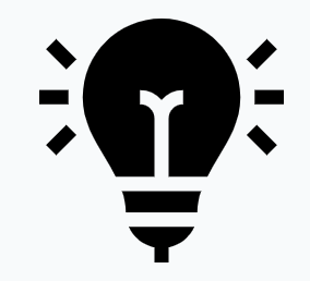
User Personas & User Journeys
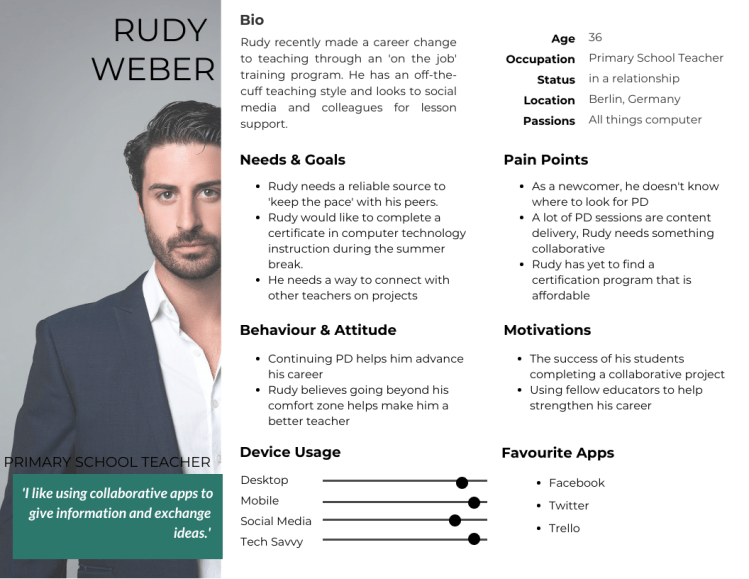
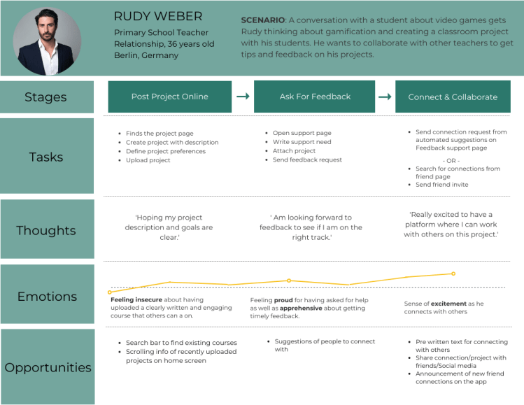
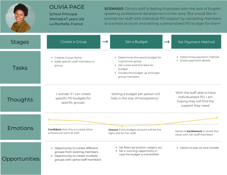
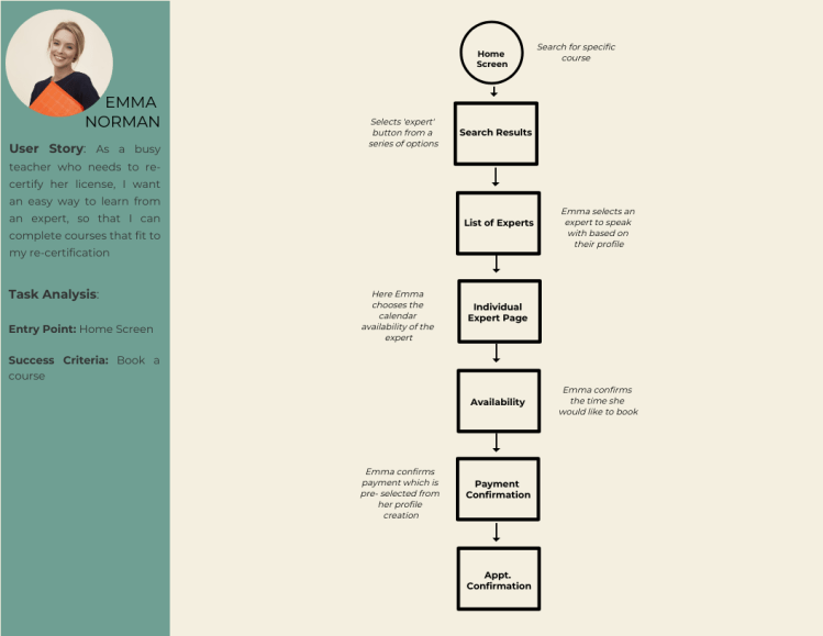
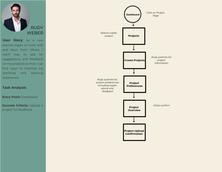
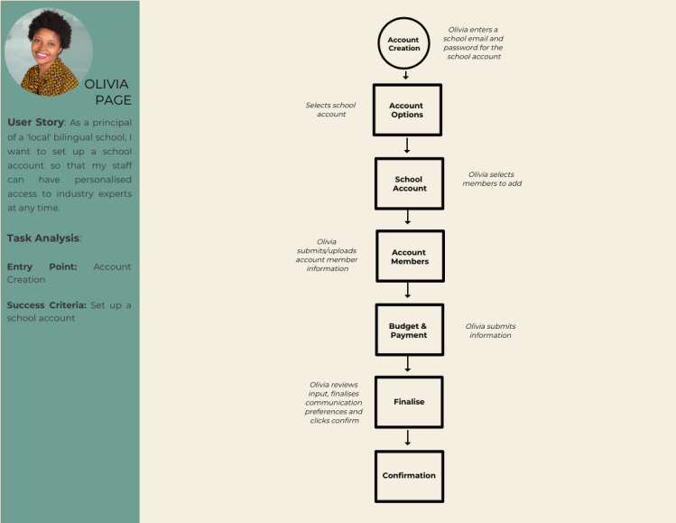
Based on the research three user personas were created. Emma is a teacher looking to re-new her license and wants to take a course online with an expert. Rudy an enthusiastic and passionate teacher looking to collaborate with other teachers on his project. Finally, Olivia is is a school principal looking to set up an account to ensure her staff has access to personalised professional development.
In order to feel what the user goes through during the task, I created a journey map for the tasks that align with the business goals: setting up an account for school members, booking a course and creating a collaborative project. The goal of this user journey is to simplify the task into small phases to identify areas of opportunity in these phases.
Information Architecture
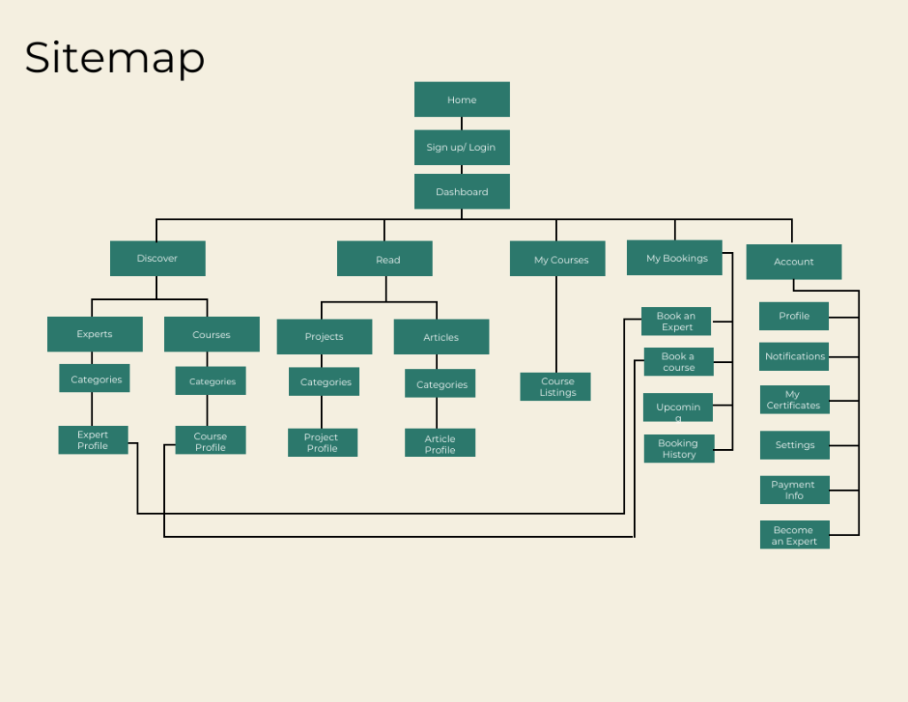
In order to create detailed steps and illustrate complete paths, I needed a starting point and a plan for my user flows. This was to ensure that I could design an effortless and satisfying way for users to achieve their goals. I mapped out three task flows to help me identify the screens my users would access. To make sure that everything for my users ran seamlessly, I created a site map as well as conducted open and closed card sorting via Optimal Workshop.
Beginning The Design
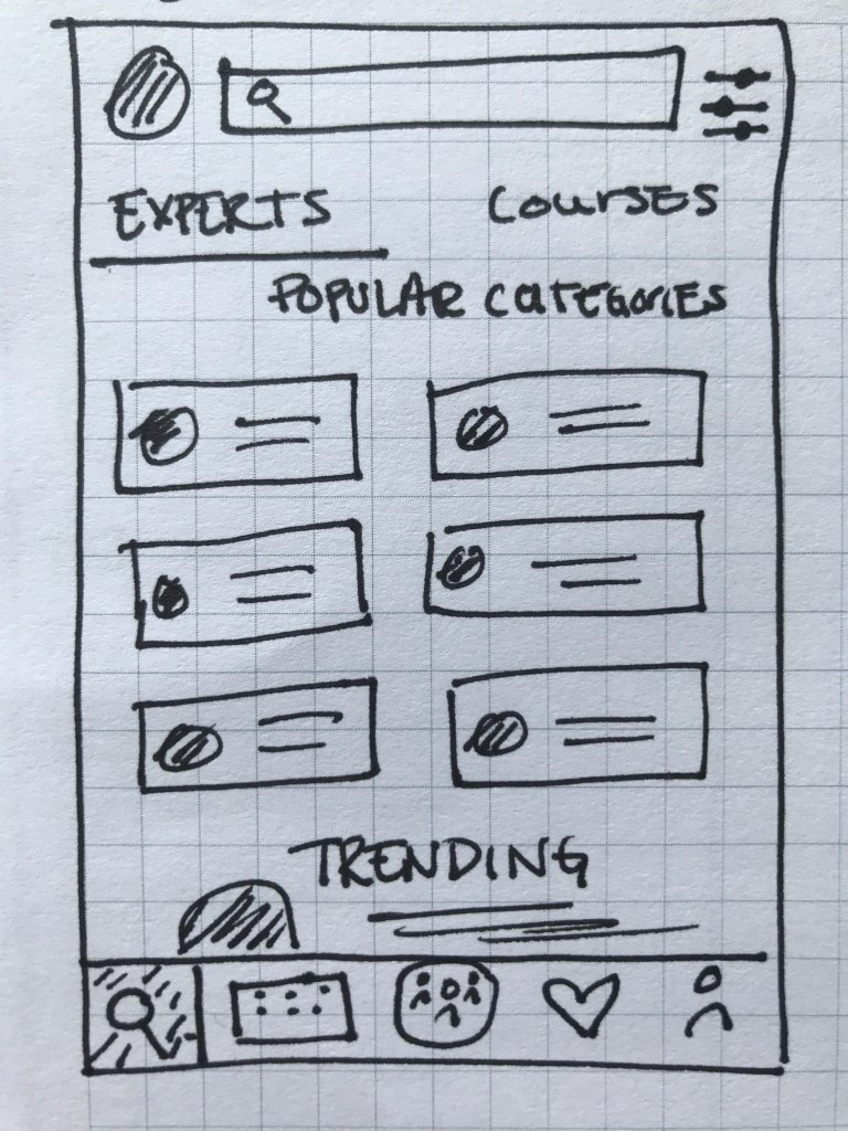
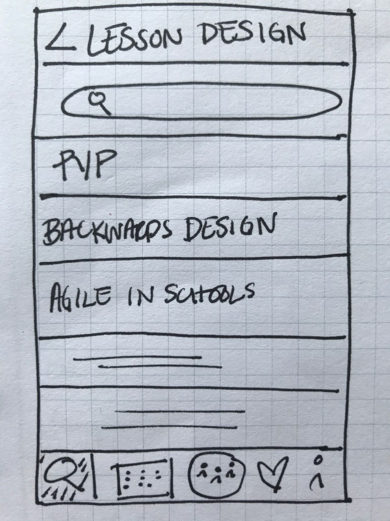
Throughout the design, my wireframes were created in low, mid and hi- fidelity. Low-fidelity wireframes were hand sketched which allowed me to quickly generate ideas and iterate them more easily.
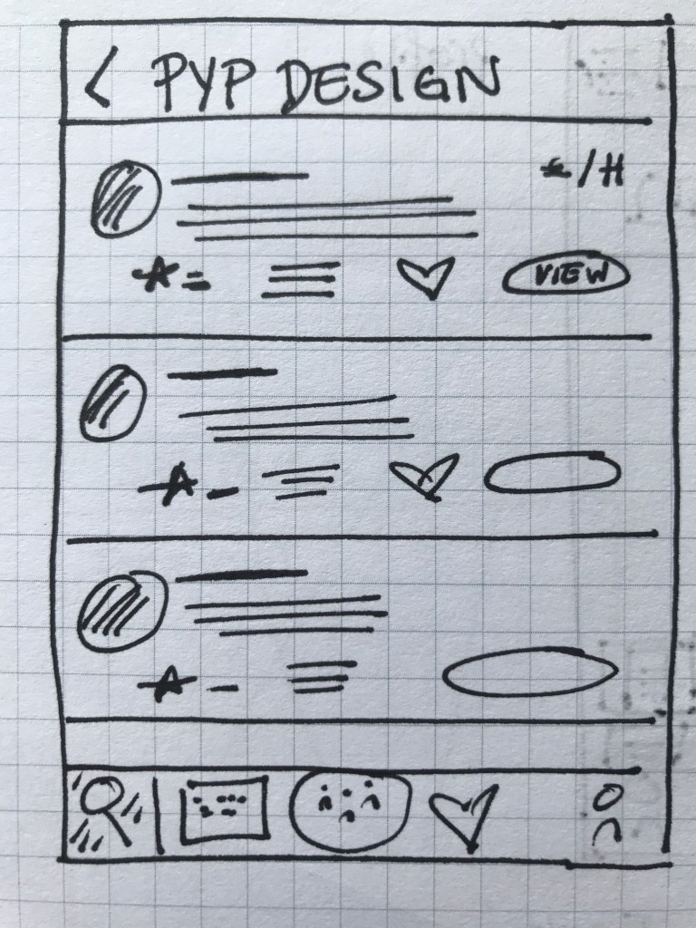
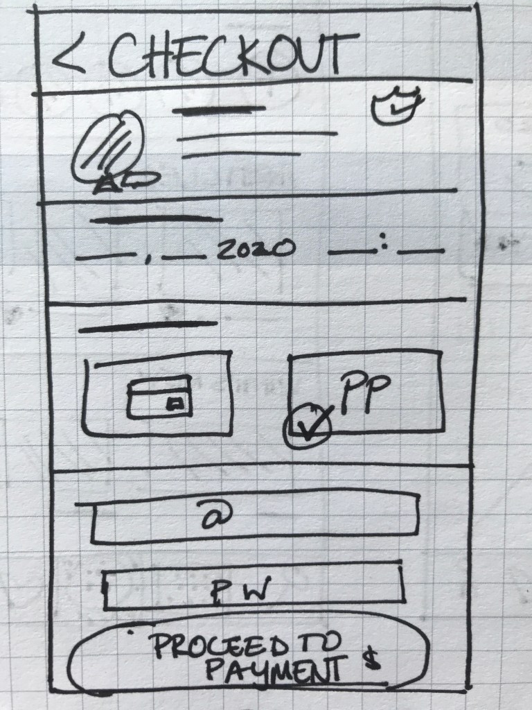
Discover Experts
Search Courses
Expert Listings
Expert Details
Booking a Call
Checkout Screen
With the first low-fidelity sketches came the first feedback from those who interacted with them. This gave me my first learning opportunity on how to improve my prototype. I quickly began gathering ideas of how to improve this prototype. For my mid- and high-fidelity wireframes, I designed the prototype on Adobe XD and Figma.
‘The amount of content seems a bit overboard… especially on such a small screen.’
Quote from Usability Tester
Refining The Design
While not complete, the mid-fidelity wireframes allowed for the app to be more completely represented. The design began to take on a more consistent shape and provided a more transparent representation of the app’s functions.
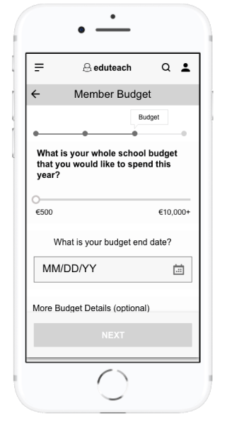
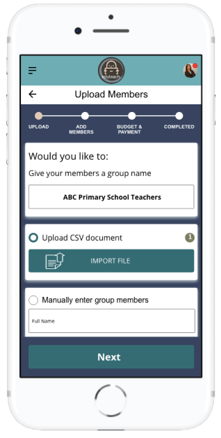
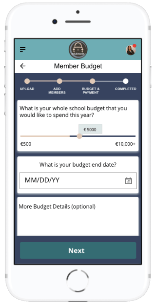
With a more defined prototype, the amount of feedback began to increase. This feedback highlighted some flaws in the design, especially in regards to the user flow. This was most notably seen in the ‘creating a school account’ section. Firstly, when trying to import members into a group. Here it wasn’t clear who should go into a specific group, mostly because the group name came after the members were already imported. Additionally, the process to specifically set a budget for individual members was not as transparent as I thought. I thought more about this and other feedback and decided to add the group name as the first requirement when creating a group in addition to allowing users to set a yearly amount plus an individual amount per person when setting a budget.
‘The budget amount per member is not easily defined.’
Feedback from Usability Tester and Fellow Design Student
Perfecting The Design
Keeping all of this feedback in mind, I began designing the high-fidelity wireframes; first in greyscale and later in colour. Here a lot of change was made in regards to element placement, information architecture and user flow. More specifically, I realised, as my app contains a lot of information and categories, that I needed to find a better way of organising information, which I decided to do through created tabs. I also created more transparency in the process by adding a progress bar to the tasks.
‘It’s not clear how many steps there are.’
Feedback from Usability tester
Finalising The Design
Once the high-fidelity wireframes were in greyscale, I began to run wider usability testing. The goal of my test was to understand the learnability, efficiency, satisfaction and errors of the app for first time users. My test focused on three main functions.
Account Creation:
How fast can people set up their account?
Are users wary about entering a payment method to their account?
What are the most common errors when entering data?
Does the flow fit with the user?
Booking an Expert:
Will users search and decide on an expert?
Are there enough filters to help users reach their goal more quickly?
What are the most common ways a user goes about looking for an expert?
Can users understand how to use the filters?
Does the calendar function work well for users?
Uploading Project:
Do users know where to upload projects?
What are some missing features when uploading a project?
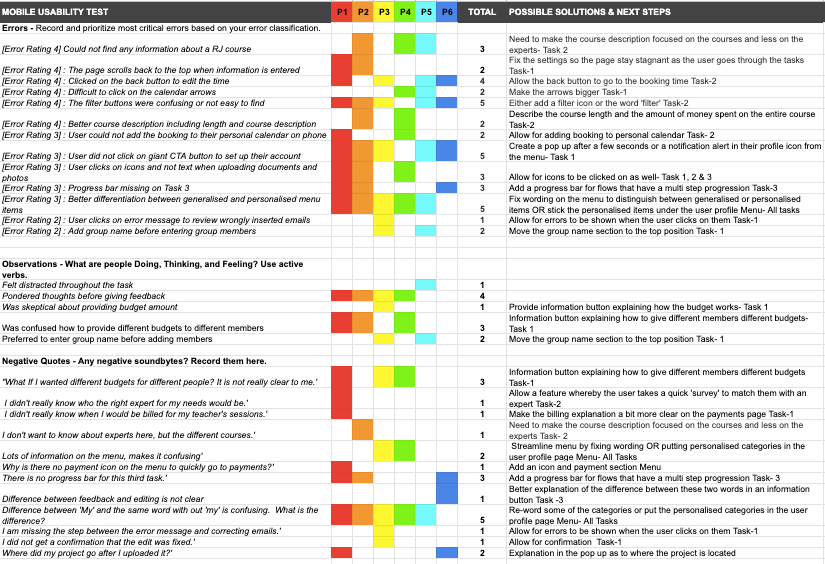
In person and usability tests were conducted with 6 people both in person and online. After a few background questions, users were asked to complete several tasks on the Eduteach prototype. By observing users facial expressions and body language and analysing the recorded results, I gathered all this information into a rainbow sheet where I could interpret the results and brainstorm the next steps of refining the app
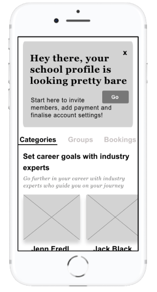
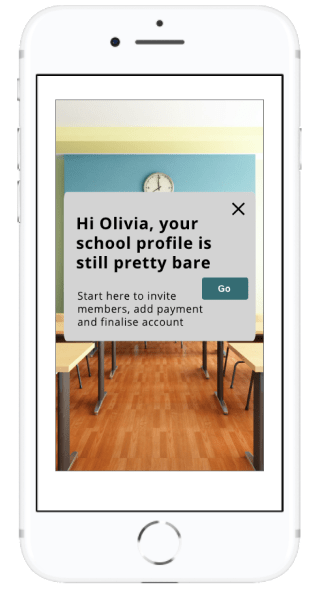
There was a lot of useful feedback that I received and analysed during during the final phase of my usability testing which helped to launch my app into the next phase of the design. One of the most notable things in the design was the CTA button asking users to complete their account. Over half the users failed to see this button in the usability testing. Thus, I decided to add this button as an overlay once the user clicked on the dashboard.
Call To Action Feature
Here the CTA button was located at the top of the screen. However the majority of usability testers didn’t recognise its purpose.
The CTA button has been added in a layover when the user clicks the screen. This ensures that the user will be guided to finish setting up their account more easily.
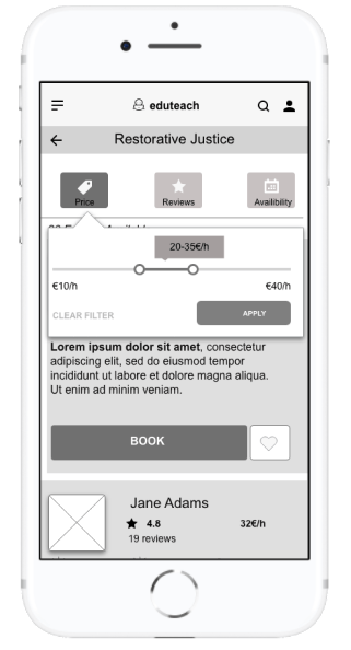
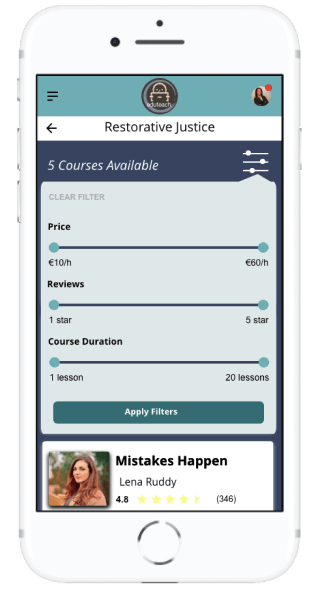
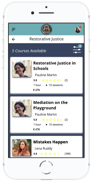
Filters When Searching For Courses
Here the filter buttons were not really seen as actual buttons and, as there was no filter symbol, many users were confused as to what purpose these buttons served.
The filter buttons were combined. Users then accessed them from the filter icon and can apply as many or little filters as they want.
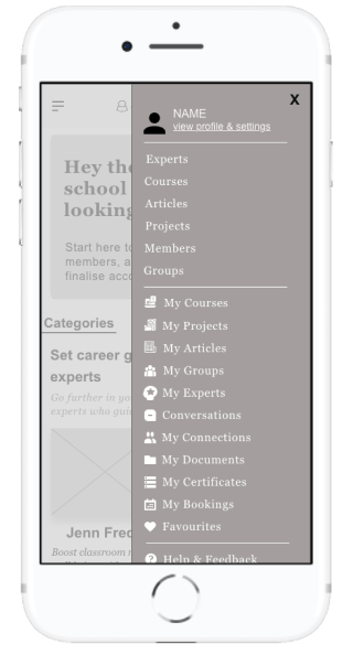
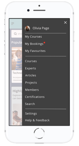
Menu
Many of the users were confused by the general category, such as projects and ‘my’ projects. The difference in the menu was not clear to them and many had a hard time navigating the menu.
Here the menu has been more streamlined to allow users quick access to things relating to their bookings and courses and favourites. Everything else remains part of the general menu.
Style Guide
Eduteach is about providing professional development services to educators on the go or for educators who cannot find courses and experts in their local community. The app conveys a level of professionalism but also feelings of familiarity. This was especially important to me when creating my style guide. My goal with Eduteach was to choose the primary color blue, thus evoking a sense of reliability, trustworthiness and communication. Choosing green as a secondary color, indicating growth and vitality. Branding was kept to a minimum with the logo being displayed only in the header. The tone of the app is professional yet familiar and tried to create a comfortable feel for users when booking and speaking with experts.
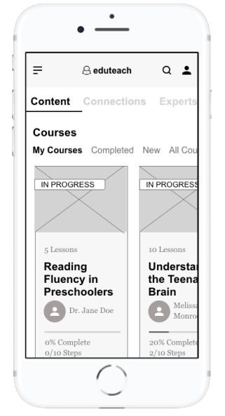
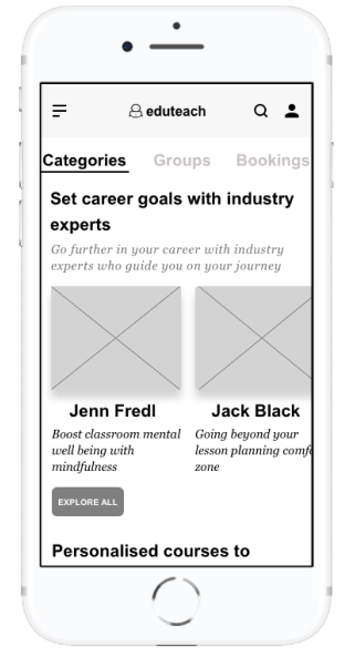
Final Design
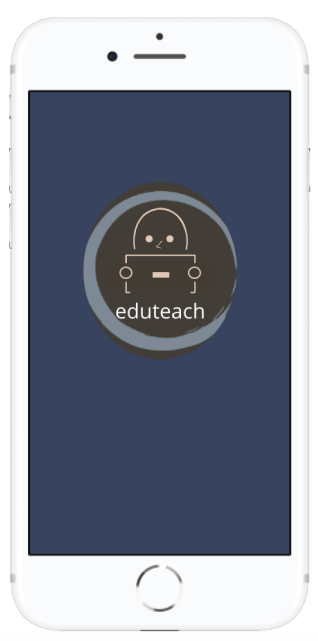
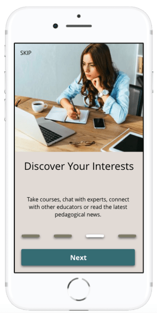
Getting Started
a quick and easy way to login to Eduteach
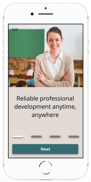
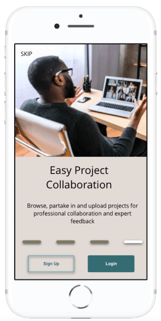
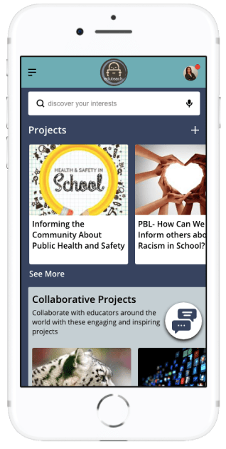
Onboarding
The main overview of the apps functionality
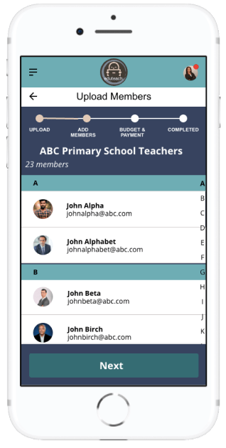
Set Up Group Account
Allow staff members to access professional development through a few easy steps
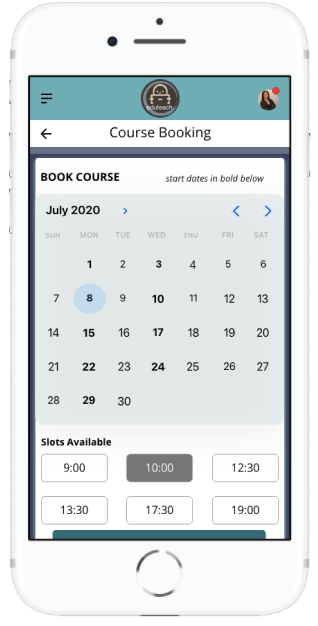
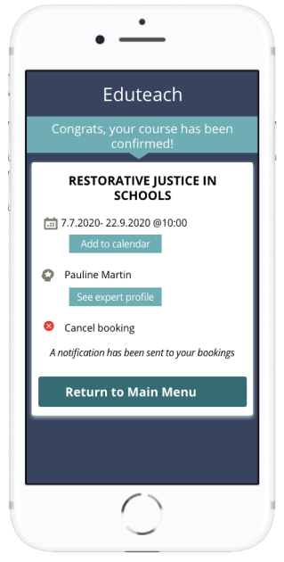
Book a Course
Choose course, select date and time, and confirm
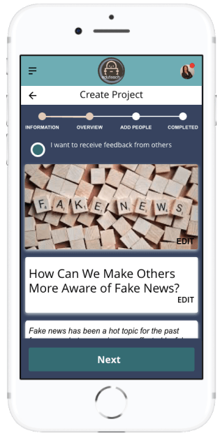
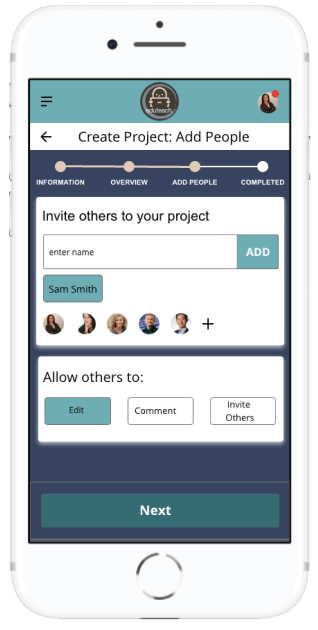
Create and Upload Project
Work on projects together by collaborating with other educators and students
The creation, design and implementation of Eduteach has been a rewarding experience that has given me a design process experience from the initial concept to the final prototype. Although at times challenging, I loved diving deep into this project and learning all the about human-centred design process. In addition to learning about design tools, techniques as well as developer possibilities, I also gained new insight surrounding quantitative research techniques, actively listening and rapid design iterations. Although my design took on many different shapes throughout the process, the focus on user needs remained constant.
I am also pleased with the visual design of this app; the colour palette and images chosen were designed to make the app look professional yet inviting. I also made designing for accessibility a priority more specifically in my design of a chat function for those who have physical impairment where typing may be difficult for them.
What Can I Do Better?
Finding likeminded competitors was difficult for me. I would like to improve on this research next time as well as add a survey for users in this step to help me understand where the competition better lies.
Next Steps
The work of a UX designer is never finished, which is why I find this type of work especially appealing. Even as my prototype was in its final stages for this project, user feedback had me thinking about the next steps. Going forward, I would have re-designed the filter buttons and options, as this was an area testers spoke about often. By focusing on this aspect during another round of user testing, I could gage how users respond to and interact with this feature. I would also like to further my responsive website by designing a version that is compatible with a tablet.


 Anne Fischer Design