My Role and Workflow
My Role: UX/UI Designer
Project Duration: January- March 2021
Tools: Adobe
Serlo is a non-profit organisation that offers support, explanations, courses, videos, exercises and examples for students to support student learning in their own space and time. The learning content is created by highly-qualified teachers and professors. To date, over 1.25 million people per month use the platform. In order to create more transparency and to attract more attention from users, Serlo wanted to update their profile page and asked me to support with the UX and UI design of this project.
The Challenge
Being a non-profit organisation, Serlo has mainly worked in the past with volunteers who helped create the content for the learning platform as well as with volunteer programmers who helped to design and maintain the platform and website. As they rapidly grow, they are looking to attract more users to create content by awarding them with badges and gamification techniques. Additionally, they are looking to increase their donations quota. They hope to do this by creating a more streamlined profile page with which users can message each other as well as see the progress of their work and donations easier.
‘How might we re-design our profile page so that we may increase user content contribution, user donations as well as exchange between users?’
Setting The Criteria
Before I connected with Serlo, much of the user feedback had already been collected, thus it was more of a matter for me to take this feedback and to turn it into wireframes for both the mobile and desktop version. Criteria was set from two sides, from those of the users and those of the company.
User Criteria:
- The ability to describe their motivations about working with Serlo.
- To be able to connect quickly with others in the Serlo community.
- To show the current projects they are working on in hopes of collaborating with other users.
- To display which areas of the platform users are mostly active in.
Serlo’s Criteria:
- Serlo wants to use gamification to increase attract more users and motivate existing users.
- The introduction of badges was also seen as a high priority for Serlo in order to reward those who contribute to the learning platform as well as to increase the number of donators.
- A simplified overview of a user’s profile page was deemed necessary in order to provide a cleaner view of a user’s progress.
- Connecting with other users was also a necessary part of increasing user motivation.
- Users should create a motivation sentence to help inspire their peers.
Creating Different Profile Layouts
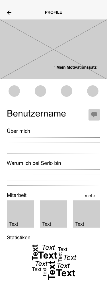
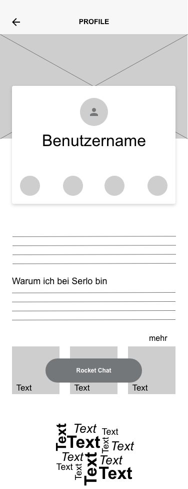
Now that the criteria was set, I was asked to create several different layouts of how these profile pages could look like. I opted for a mobile-first design (the desktop version was designed at a later date) in order to ensure that the clean, simplified overview that Serlo and its users desired would be able to be displayed in a clean and modern manner. This included understanding the spacing between objects and where elements such as buttons were to be displayed. For the mobile version, I decided to go for 6 columns, on the desktop 12. My breaking points for a responsive design were 375 px for the mobile and 992px for the desktop.
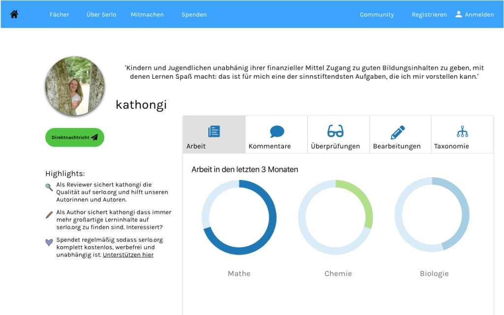
For the mobile versions, I originally created 4 versions in which the Serlo team and its users could then decide on what the best design could be. As the motivation sentence as well as the badges and messaging function were a big part of the upgrade, I initially focused on this. In the first version, however, there was still a lot of opportunity for text, something that Serlo users felt was necessary to have in order to describe their work. However, having so much text space really took away from the ability to make the page cleaner.
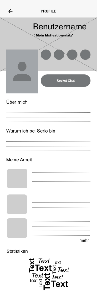
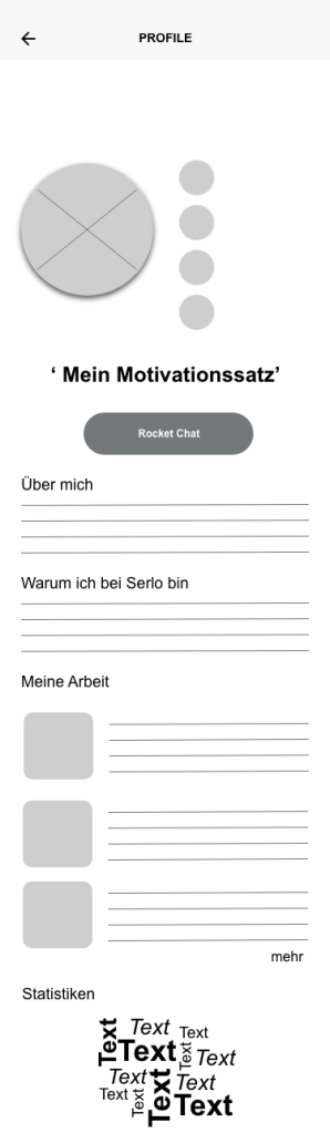
Feedback from users quickly showed that versions 2 and 4 were their preferred versions as they provided a cleaner look. Additionally, for the volunteer programmers it was an easier interface to program for and work with. After a few rounds of discussions and feedback, it was decided to further pursue the design of version number 4. Sticking with the Serlo colours, I experimented with placement of buttons and icons.


Desktop Version
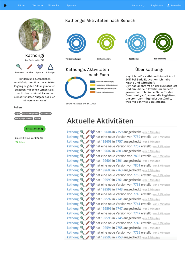
As Serlo users mostly work on the desktop, it was imperative to create a desktop version of the profile page. Once the ideas and concepts were laid out for the mobile version, I set to work on creating the desktop. One of my initial ideas was to make the information more compact by designing tabs for users to click on. This would avoid endless scrolling should a user need to find more specific information quickly. On the other hand, however, it does not offer users a quick and clean overview of some of their important criteria such as quickly overseeing the comments of fellow users.

While conducting feedback, users expressed that tabs were not very practical and aesthetically pleasing to them. Thus, I began to sketch out ways in which we could display user activity with a better overview. Some Serlo colleagues and I began discussing the use of shapes to display progression. We experimented with a few different shapes including circles, hexagons and icons as measurements for progress.

User Feedback and Final Versions
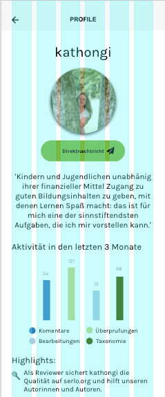
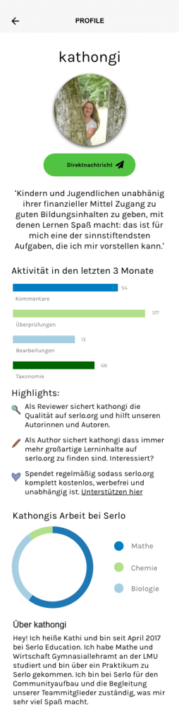
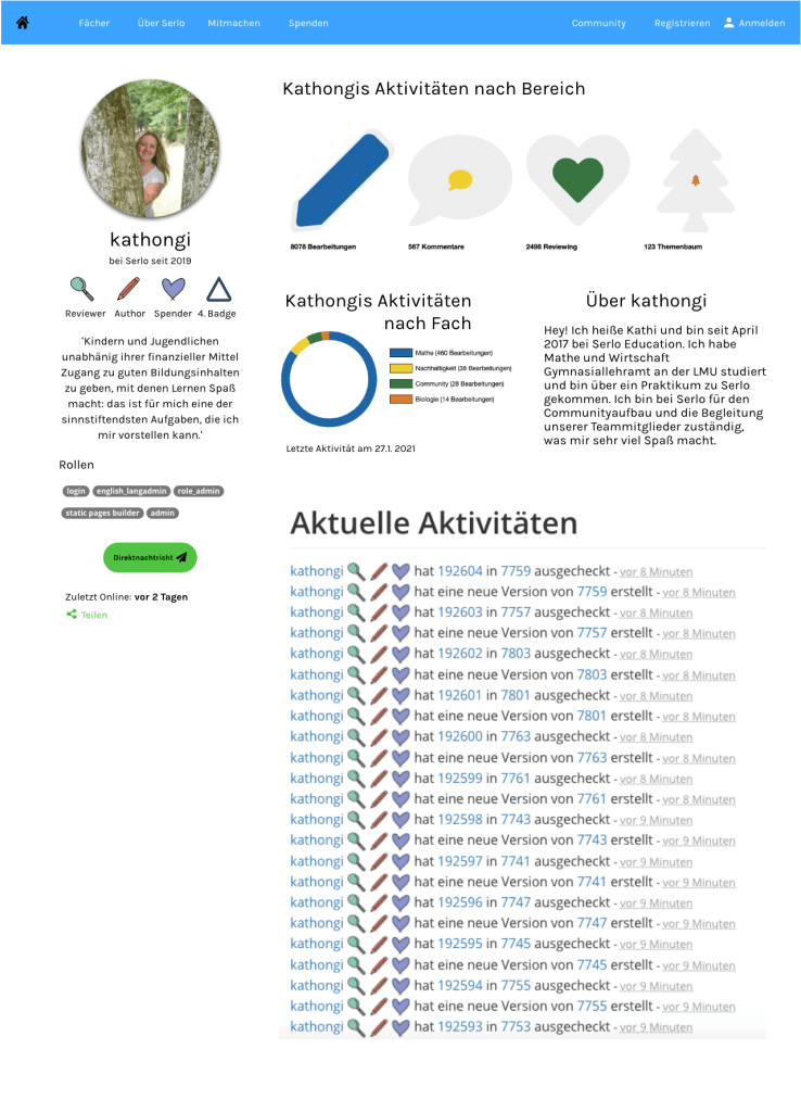
After sketching and wireframing several versions of the Serlo profile page, we received lots of feedback from multiple users and stakeholders regarding the layout. In the end, many users felt that too many circles or circular shapes could be confusing and not give as easily of an overview as thought. There was also suggestion to keep the shapes within one track instead of several. Many also wanted to be rewarded per stage of the work they had done. Extending the colour palette was also seen as a necessity as too many shades of blue and green could be misleading.
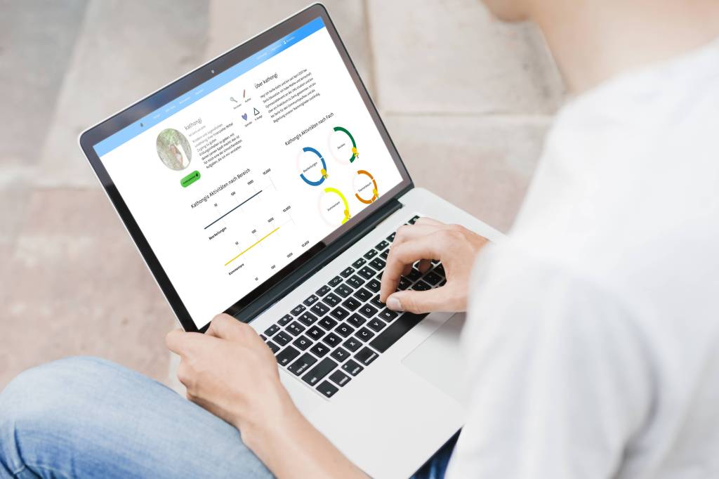
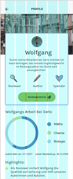
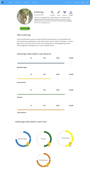
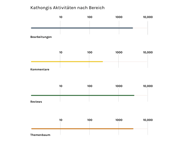
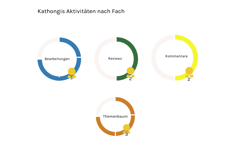
With this in mind, we created a more concrete version of the desktop and mobile page using a variety of colours and more simple, easily understandable progress measurements. To measure the progress of overall activity on the site, I used a progress measurement bar. For more detailed measurement of activity by subject, I went for a circular graph in which users were rewarded a ‘badge’ per level completed.
Reflection and Next Steps
As with many things UX, no work is ever finished :). My project with Serlo was a rewarding one; it was my first time working for a non-profit and the atmosphere of the team and the community was amazing. It was also one of the first times that I worked so closely with passionate users. On the one hand, it was a very positive experience to work with people who are so passionate about the product and the cause. On the other, it often proved challenging to introduce UX or UI best practices to them as they were sometimes reluctant to accept new ideas. In the end, we came up with a working model for the profile page but I am still working closely with the Serlo team to provide updates as needed.
As I continue this project, things that I would like to work on include making the badges more aesthetically appealing as well as to create a donations scale or badge (in the end, donations was not part of the first round of the profile page). Another challenge would be to design a ‘clever’ profile page to encourage those who are less active on the website to explain more about themselves and connect with others.
