
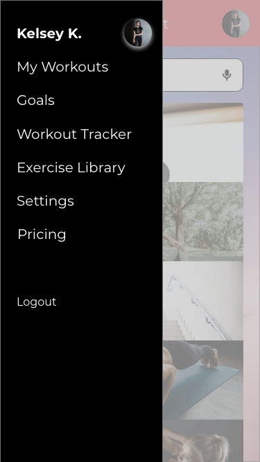
Overview
Problem: How might we motivate women who lead busy yet sedentary lifestyles into an exercise routine that is personalised, inspiring and rewarding for them?
Solution: Create a responsive web app that allows for users to create personalised exercise routines that are integrated into their daily schedule.
Role: UI Designer
Project Timeline: 5 weeks
Primary Stakeholder: Career Foundry UI Course
Tools Used:
- Adobe XD
- Figma
- Sketch
- Photoshop
There are quite a few workout apps available on the market these days making it hard for users to understand which app is right for them. Many fitness apps focus on specific regions of the body or a specific type of workout. With many promises of ‘getting fit’ in a short amount of time, it is hard to know which one to choose. In this sense, it is easy to become overwhelmed when deciding on an app to help get you in shape.
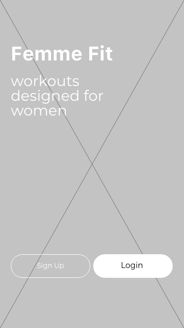
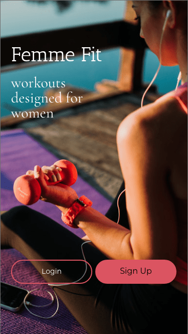
With so many apps out there, I decided to focus on a specific market; namely busy women who are looking to stay in shape in a realistic way that fits their personalised lifestyle. Femme Fit is designed to inspire, motivate and empower women into getting into shape through criteria which they set for themselves. This UI project was part of a user interface immersion project that I completed alongside my UX training. The goal of the project was to get familiar with specific UI principles, patterns and heuristics with the end result of creating a responsive app with hierarchy, colour, typography and iconography. The project took one month from mid-October to mid-November 2020.
Approach
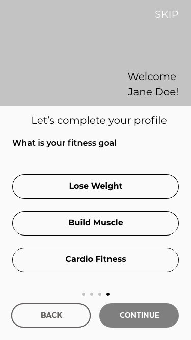
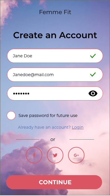
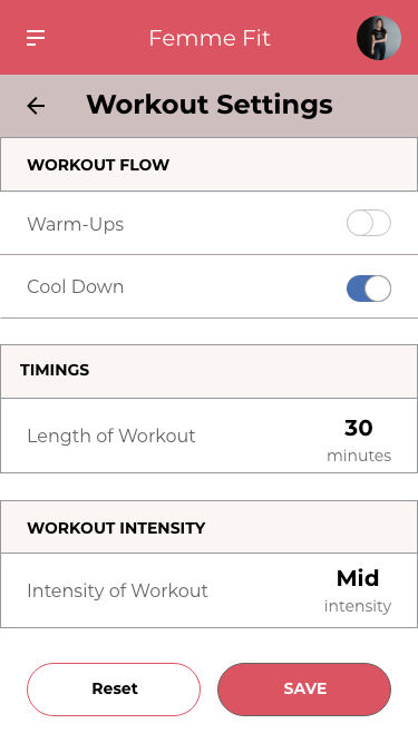
After reading the project brief and analysing similar workout apps, it seemed many of them required an immense amount of work upfront including registration and payment before the user could get started. In order to hook a user and keep them signed up, apps need to be easy to use and require minimal effort to change workout preferences. With this in mind, I gathered a list of patterns I wanted to add to the Femme Fit app.
- Adjusting sessions through AI- users would be asked for a quick like/dislike feedback after each session to determine what type of workout they like best.
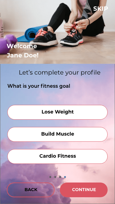
- Walkthrough– The user will get a sense of what the app does and how it can help them achieve their goals.
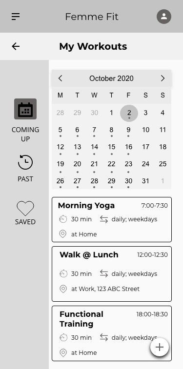
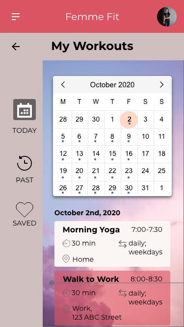
- Notifications– Users will be notified as to what is coming up in their routine and will have the ability to adjust the timings based on their schedule.
Logo Design
The logo design went through several versions, all surrounding the theme of fitness and femininity. The first logo with the weight seemed too harsh and also did not concentrate on the overall well being. The second logo with the jump rope outlines ideas of fitness and health when combined with the heart. The final logo emphasises the heart.

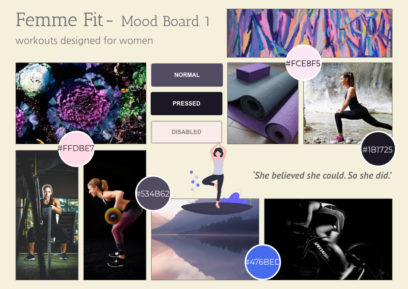
Mood Boards for Visual Direction

Style Guide
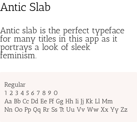
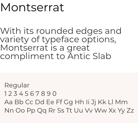
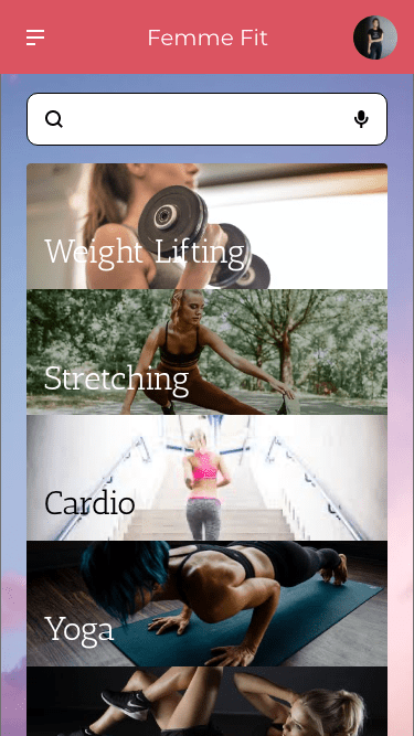
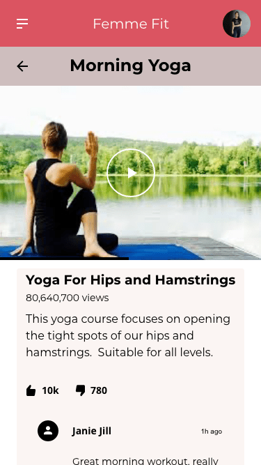
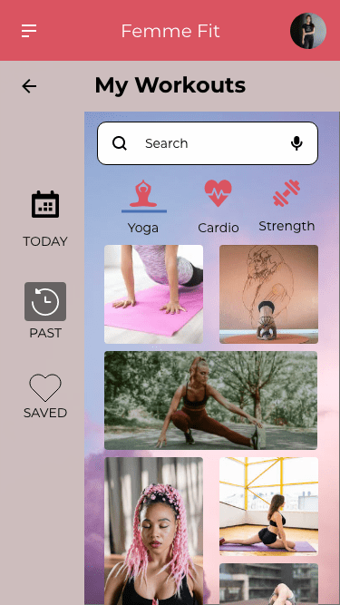
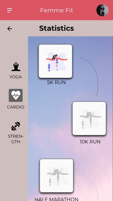
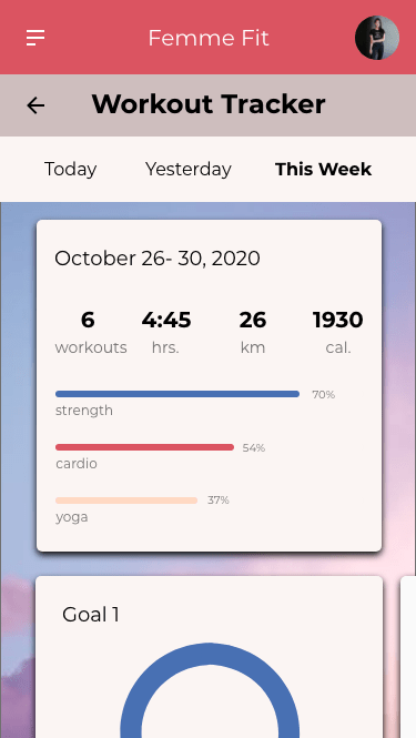
The style guide of Femme Fit reflect the apps goals of motivating , inspiring and empowering women in their workout routine. Thick and think fonts provide a combination between soft and strong while real photos of women working out are meant to provide a realistic approach to fitness.
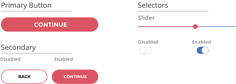
A balanced colour palette and customised icons give Femme Fit a distinctive feel and personality. However, these are not the only features adding to the app’s unique personality. The complete style guide can be found here.
Colour Palette

Typography
Icons
Buttons
Responsive Design
Responsive design was one of the most challenging aspects I learned about in this UI project. As I did not have any developers to consult with on this project, I needed to consider a few important aspects such as layout, navigation and media patterns before deciding what my breakpoints would be. In the end, I went for a 375px breakpoint for mobile, 768px breakpoint for tablet, and 992px breakpoint for desktop.

Mid-Fidelity Wireframes


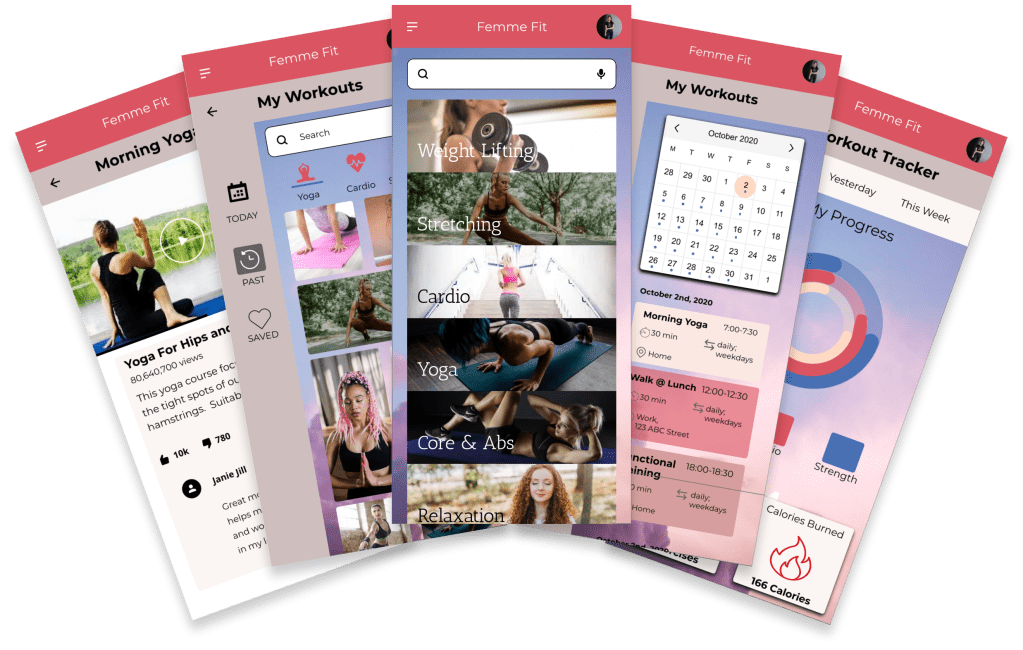
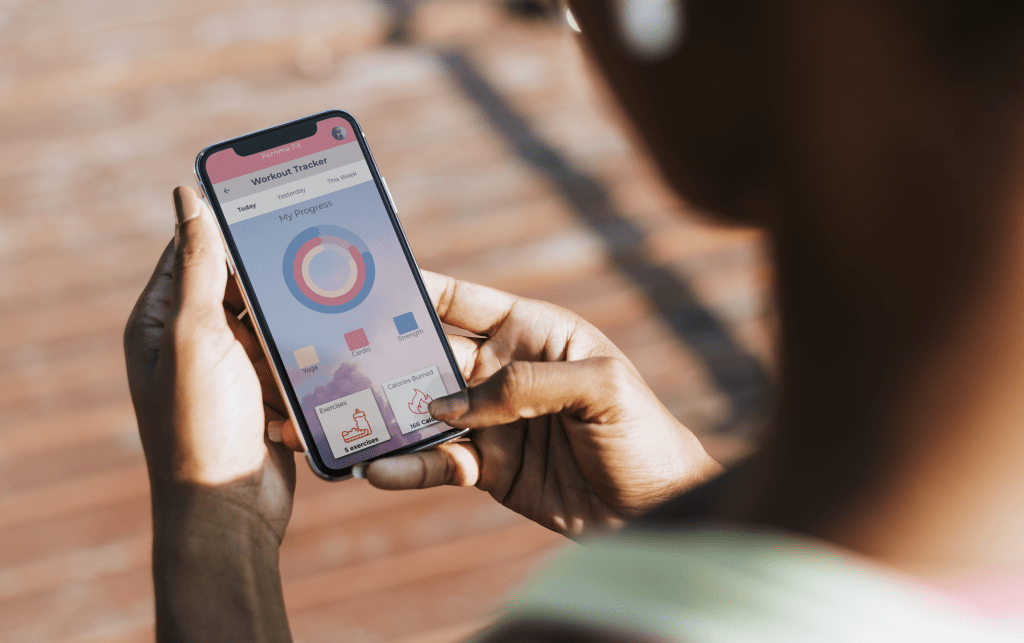
Final Screens

Femme Fit prototype can be accessed here
Retrospective
This was my first comprehensive project in UI design. My intention was to design an app that was practical to use on a daily basis combined with aesthetics that both inspire, motivate and empower women to get and stay in shape in a way that works for them. My biggest learning curve was in the responsive design, especially when designing for wider screens, deciding on what breakpoints would be best and where to place images.
Moving forward, I would add features to track habits of where and when users feel most motivated to work out. This would be in addition to designing a feature where users can connect to work out with friends. Something to gamify the features to keep users motivated would be big plus perhaps in connection with a bonus program from a local health insurance.
Looking to the design, I would want to create a dashboard to display at a glance personalised information on one screen instead of the several I designed.
