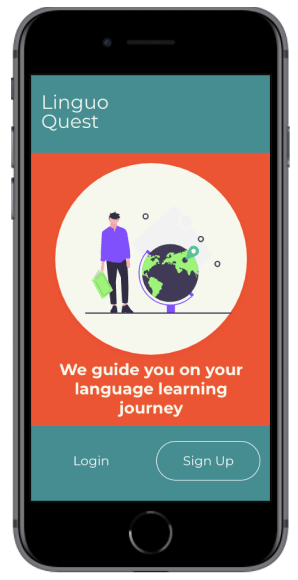
An app that guides users on their language learning journey

Objective
As the world gets smaller, the need to learn foreign languages grows. Despite this growing trend, the way in which people learn languages is such a personalised journey influenced by many factors including language difficulties, learning abilities, and personal motivation. I created Linguo Quest, an immersive, personalised language learning app that teaches people words and context and how to use them in everyday life. The goal of this app is to build vocabulary thus increasing fluency in a language.
My Role and Workflow
My Role: UX/UI Designer
Project Duration: April, 2020
Tools: Marvel, Adobe XD, Figma
Setting The Scene….
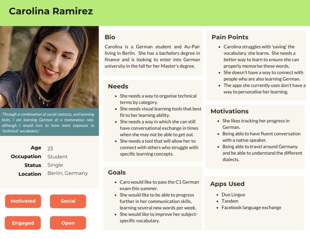
Carolina is a 23 year old Female from Colombia who has recently moved to Germany. Her goal is to master the German language to eventually study at a University in a major German city. In addition to studying and in order to immerse herself into the language and culture, she works as an Au-Pair in Berlin.
She is excited but also nervous as her university acceptance is riding on the fact that she can master the German language. She needs a way to master her vocabulary in order to pass the test. Connecting with other language learners is also an advantage for her.
‘Simply memorising words doesn’t work for me. I need more visuals, more input’
Carolina during her user interview
The Problem
Carolina has recently moved to Germany to learn the language and to study for a university entrance exam. How can she best build her vocabulary and connect with others? She needs a platform that can deliver her streamlined and concise language practice as well as help her connect with friends. Until now, she has not found a way to combine both possibilities in one app.
Hypothesis
We believe, that by building an app that allows for users to organise subject specific words by category as well as allow her to connect with other language learners, we will achieve Caro’s goal of personalising her learning.
The Solution
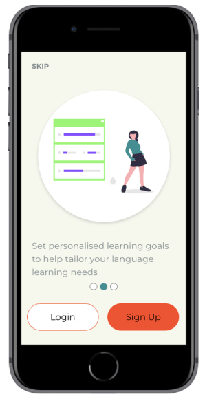
At Linguo Quest, users will be able to study a language through a variety of engaging learning practices that fit the learning abilities of each user. Not only will users be able to measure their progress, but they will also be able to set personalised learning achievements that ensure they reach their desired goals.
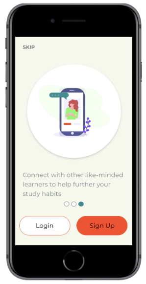
Linguo Quest also serves user needs by allowing them to connect with other language learners. This helps them strengthen their vocabulary in addition to finding a community which they can rely on.
Understanding The Problem
Competitive Analysis
In order to understand how I can best serve the needs of my users, I first conducted a competitive analysis. I analysed three language learning apps- Drops, Vocabulary Builder by Magoosh and Quizlet. Here are some key takeaways from my competitive analysis.
Drops

Pros
- 14+ vocabulary sections with various levels for each section
- Infographics for each vocabulary word help visual users
- Variety of games and activities within each set
- Advanced statistics of user progress
- Immediate feedback on correct and incorrect words
Cons
- Users are only allowed to practice 5 minutes every 10 hours on the free version.
- Lots of distractions and advertisements to be a pro user
- There is no where to mark or ‘star’ a particular word
- There is no ability to customise sets
Vocabulary Builder By Magoosh
Pros
- Progress bar shows duration of set
- Words on flashcards are clearly defined and well positioned
- Users get immediate feedback and detailed definition on each word they try
- Possibility of playing online with others
Cons
- Sections must be completed in order. Could come as a frustration for users looking for more of a challenge.
- Audio button only available in the word definition explanation. Users can only hear native pronunciation after they attempt the word
- There is no where to mark or ‘star’ a particular word
Quizlet

Pros
- Ability to share set and app with others
- Audio button to hear native pronunciation
- Variety of activities focused on different learning styles
- Customisable flashcard groups for preferred words
- Variety of question types during test
Cons
- New study sets can only be added through the search page and not the home page.
- Quizlet live game can only be played with a code from teacher. There is no ability to play with others online if you are studying by yourself.
- Advertisements contain pictures. This could confuse the user when they are using study sets with visual aids.a
User Interviews
I conducted three user interviews with people who are currently language learning students and who currently use language learning apps to help their studies. The individuals were all aged 23-27 and lived in Berlin.
Key Findings
- Users needed an app that combined vocabulary learning with listening skills. This would help them hear how to pronounce the words easier.
- There was a need for users to be able to study vocabulary sets with other language learners. This was seen as a great way to connect with others while also learning a new language.
- They need an app that can be used easily on the go, no matter what situation they are in.
Thinking
I think apps can help you stay connected when learning language
I think language learning apps should be free or should have more exercises in them
I think we can learn effective ways of communicating by building our vocabulary
Feeling
Deciding what topics to study helps me feel more motivated to learn
I feel frustrated when apps do not offer me enough exercises to practice with
I feel frustrated when I can’t remember previously learned vocabulary
Doing
I like to practice my vocabulary by talking with others
I like to use apps on the go for review. I like to be able to study anytime and anywhere
I like to use a variety of study methods when learning a language, especially for vocabulary
Ideating Solutions
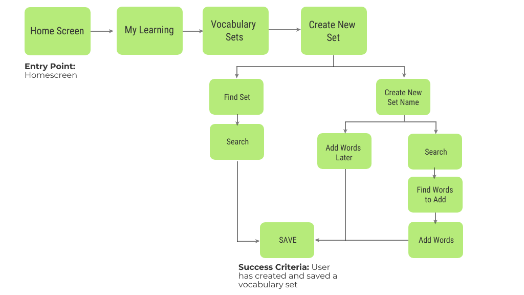
User Flow 1- Create a personalised vocabulary set
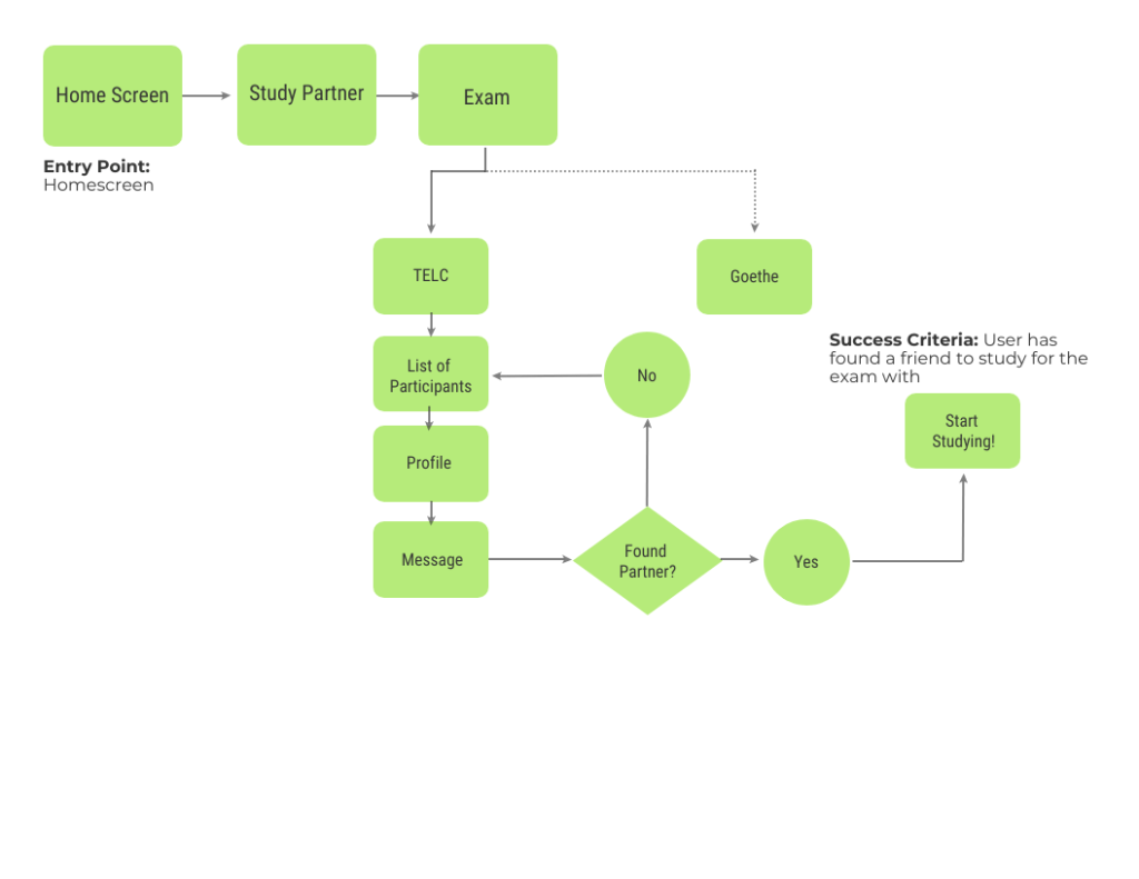
Flow 2- Connect to Other Exam Learners
Prototyping & Usability Testing
Once it was established who we were designing for and what their journey would be, it was time to start prototyping. I initially started off with low-fidelity wireframes surrounding these tasks. I designed three tasks for my users:
- Practice your personalised vocabulary set ‘travel’.
- You would like to connect with a study partner to help you prepare for your exam.
- Set a new learning goal for yourself.
As this was a rapid prototyping and iteration exercise, usability testing was done with low- and mid-fidelity wireframes using the Prototyping on Paper app from Marvel.
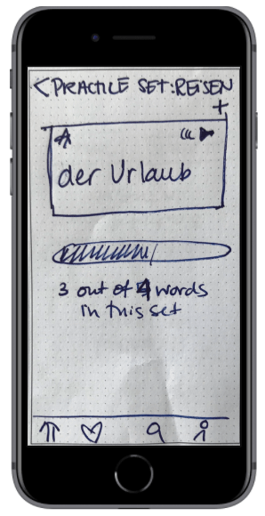
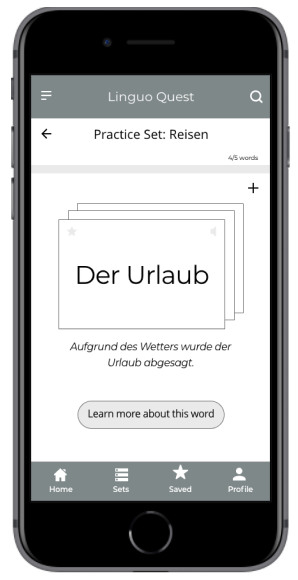
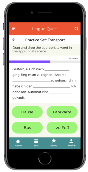
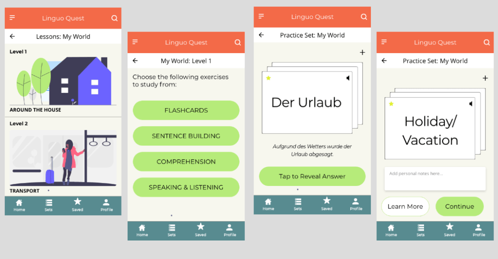
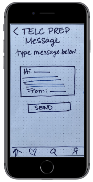
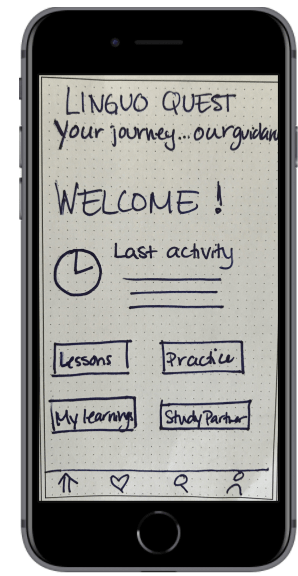
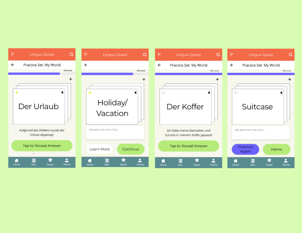
Practice a Personalised Vocabulary Set
Here, users encountered a variety of obstacles in when trying to practice their vocabulary set. Some users wanted more details and examples of the words while others did not understand how the flashcards flipped. Furthermore, the progress bar location confused the users. Here, I created an option for users to learn more about a particular word, moved the progress bar to the top as well as re-designed the flashcards to help users understand how to use them.
LOW TO MID FIDELITY WIREFRAMES- Practice Vocabulary Set
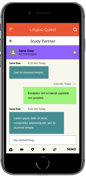
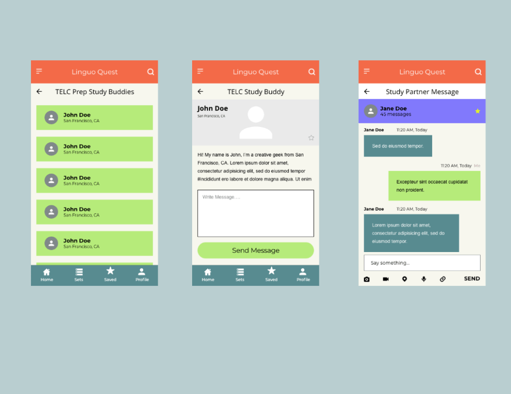
Connecting With a Study Partner
During the usability testing, all participants were frustrated with the fact that they could not get any detailed information about the person they would study with. In the mid-fidelity version, I allowed for the user profiles to be visible as well as added a chat function so that users can have more transparency with whom they are studying and be less frustrated by connecting with a partner that suits their needs.
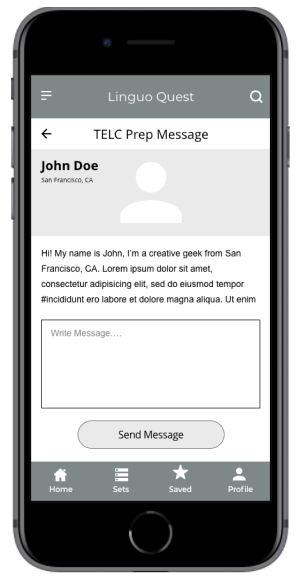
LOW TO MID-FIDELITY WIREFRAMES- Connect With a Study Partner
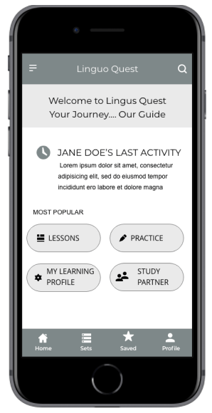
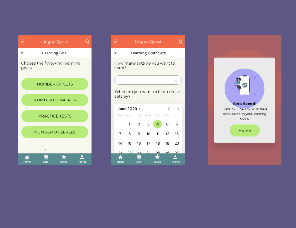
Set a New Learning Goal Date
The users who do not have English as their native language were often confused as to where to go to create a personalised learning set. I added icons to help guide users understand the meaning. Here I stuck to known symbols, making the design more universally acceptable.
LOW TO MID-FIDELITY WIREFRAMES- Set a Learning Goal Date
Design
Retrospective
What went well?
Overall, despite the rapid tine frame in which this project was completed combined with the fact that the usability testing was conducted with paper prototypes, I am please with how things turned out. The feedback from users provided useful insight for my mid-fidelity wireframes and also gave me a good insight into the world of user behaviour and needs.
As this was my first ever prototype, I am pleased with how the layout and the color combination looks- there was definitely a big learning curve for me when it came to understanding UI elements!
What Could Be Better?
As this was my first ever project, I wasn’t sure what to expect when it came to usability testing. Thus, my scenarios and tasks came out confusing to some. This combined with the paper prototypes got the test off to a rocky start for some. Next time I will think about the scenarios and tasks in more detail, describing them in a way in which all language levels can understand.
What’s Next?
Looking ahead, I would like to build a full-fledged high-fidelity prototype for this app and continue with another round of usability testing. I would also like to focus on designing for accessibility and making the app more friendly to those who have language learning difficulties.
