An app that provides reliable, professional development and expert advice for a changing educational world
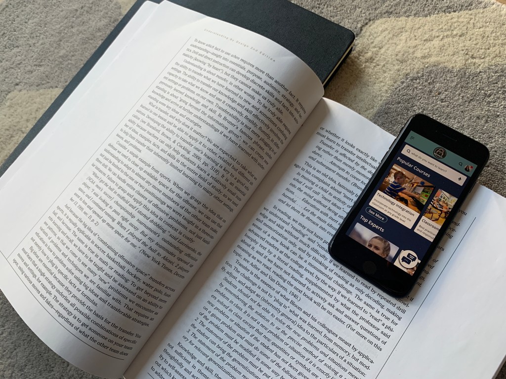
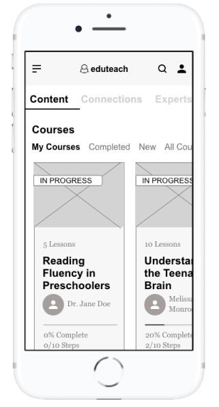
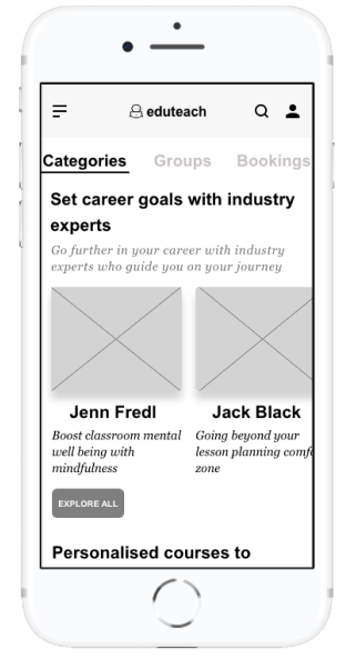
Eduteach is a responsive web app that allows educators to instantly connect with an expert, get advice on the latest education topics, partake in professional development courses and connect with other teachers globally.
The idea for this project came from the foundations of an assignment I was given in my UX certification course. Although I was provided the outline, I had considerable flexibility to adapt the concept and design. My initial idea focused on connecting experts with industry experts; in the end I added two other features to the product based on my research (see below). Firstly, I wanted to attract teachers who are keen to partake in professional development courses online. Secondly, connecting globally with other educators was seen as a necessary feature for this app. Finally, as this was a responsive web design, I wanted to focus on a mobile first approach.
‘To provide future generations with top-quality education, teachers need to find a way to stay ahead of the curve in an ever-changing world.’
My Role and Workflow
My Role: UX/UI Designer
Project Duration: April- September, 2020
Tools: Adobe XD, Figma, Sketch, InVision
The objective of the course project was to design a simple and intuitive way for users to connect with an expert within a particular field. The app is designed to be used for free, however, a payment would be required for calls done over the platform. I was solely responsible for concept and design until handing off the project to developers. I used the design thinking methodology as an outline to guide my project. This project was done on a 20-30 hour per week basis alongside a full-time job.
01
Research
Competitive Analysis, User Interviews and Surveys
02
Define
Affinity mapping, creating personas, user journey and task flow
03
Design
Sitemapping, wireframing, hi-fidelity prototyping, visual design and language guide
04
Test
Usability testing, preference testing, peer review and design collaboration
The Challenge
The world is changing at a rapid pace, yet education, testing and teaching methodologies have remained largely unchanged in the past 150 years. Under pressure from the government and institutions to prepare students for the 21st century, teachers are left feeling frustrated, under a lot of pressure and burnt out over the variety of tasks they need to achieve in order to further student success. Teachers are keen on developing themselves professionally, but feel challenged by taking time out of school to attend workshops and often feel disappointed by a ‘one-size fits all’ approach to professional development.
The challenge was in creating a product that would connect educators with the latest education topics which supports their professional development by connecting them with industry leaders and courses that support them on their professional journey.
‘How might we provide educators with a more personalised and authentic professional development experience?’
Competitive Analysis
To understand the market and identify existing offerings and highlight possible problems, I conducted a competitive analysis. At the time of research, my competitive analysis showed that there were very few direct competitors allowing teachers to connect with a pool of experts and undertake online courses with them. The number of indirect competitors, such as coaching websites, was larger yet they did not specifically target educators nor did these competitors have a focus on the education market. I focused on EdSpace and Coach.me for a more in-depth analysis.
Using the SWOT analysis, I decided that there was more opportunity in the market for the app I was designing. In this context, differentiation with my app is key, especially in regards to connecting with the community, personalised professional development and re-licensing certification.
EdSpace
Strengths
- Peer-to-peer professional development
- Available worldwide
- Self-paced learning
- Free app upon sign in
- Simple value proposition
- Internal Messaging
Weaknesses
- Reply only to individual videos, not chats
- Limited number of people using the app
- Variety of those posting videos is low
- Videos can only be uploaded to pre-selected channels
Opportunities
- Allow for group chats
- Allow individuals to create channels instead of being created by app team
- Allow for virtual networking
- Allow for discussion groups
- Add career mentoring
Threats
- Pre-existing teacher websites
- Career Coaching Sites
- Groups (example facebook groups)
- Blogs that focus on teacher classroom ideas
Coach.me
Strengths
- Peer-to-peer support
- Goals chosen by individual
- Available worldwide
- Free app-coaching for a fee
Weaknesses
- Focus mostly on the individual
- No ability to ‘talk’ internally between users
- Very similar topics for support
- No community support
Opportunities
- Internal messaging between followers
- Option to recommend/review coach
- Allow for discussion groups
- Add career coaching
Threats
- Lack of career coaching
- Similar to other coaching apps
- Rise of AI that doesn’t require manual tracking

User Research
The goal of my user research was to understand the goals, motivations and pain-points of my users that arise when participating in professional development. As my app’s goal was to provide users with a more authentic and personalised professional development experience, it was imperative that I understand the obstacles my users face when trying to reach these goals. I conducted 4 research interviews and a survey with 15 people to help me understand what motivates or demotivates my users and why.
Key Insights
Users have a high need for professional development that is personalised. Practical, differentiated and inspiring sessions are the key to good professional development.
Due to personal time constraints, users may be wary about using an app that requires a subscription fee. Staying connected to mentors is important for users to maintain their motivation.
Accredited certification advances a user’s career. However there is currently no one reliable PD source or website in the market to conduct professional development as a teacher.
User Personas & User Journeys
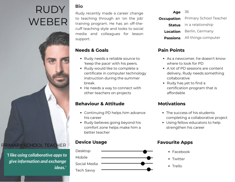
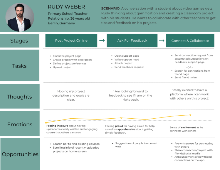
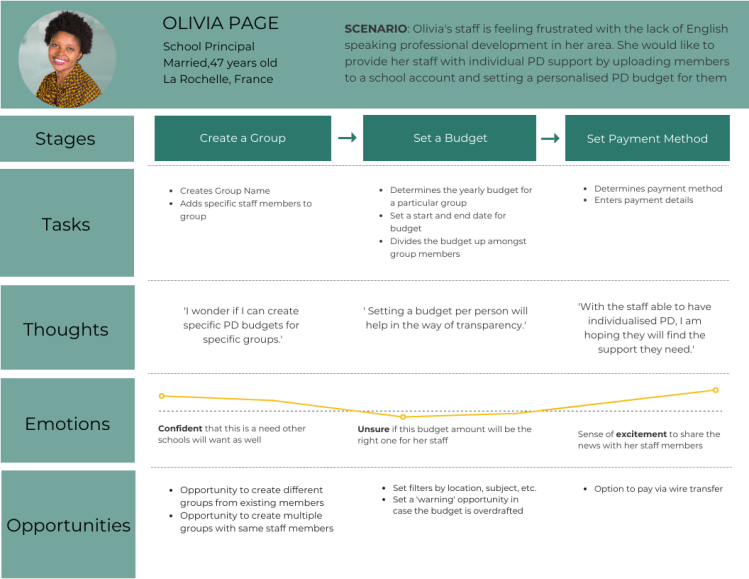
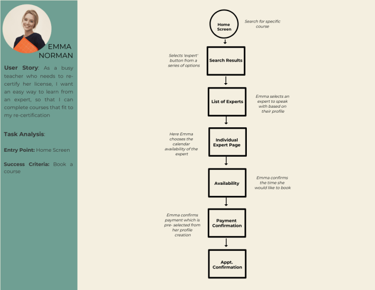
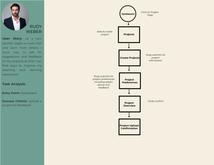
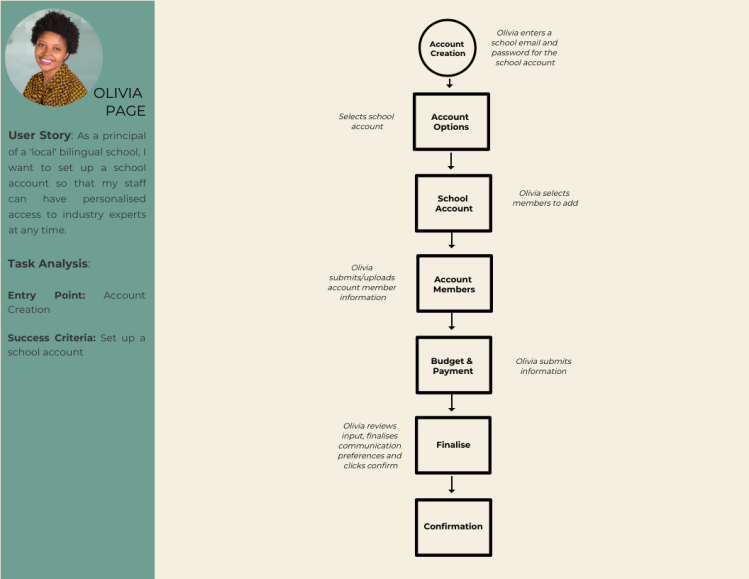
Based on the research three user personas were created. Emma is a teacher looking to re-new her license and wants to take a course online with an expert. Rudy an enthusiastic and passionate teacher looking to collaborate with other teachers on his project. Finally, Olivia is is a school principal looking to set up an account to ensure her staff has access to personalised professional development.


In order to feel what the user goes through during the task, I created a journey map for the tasks that align with the business goals: setting up an account for school members, booking a course and creating a collaborative project. The goal of this user journey is to simplify the task into small phases to identify areas of opportunity in these phases.

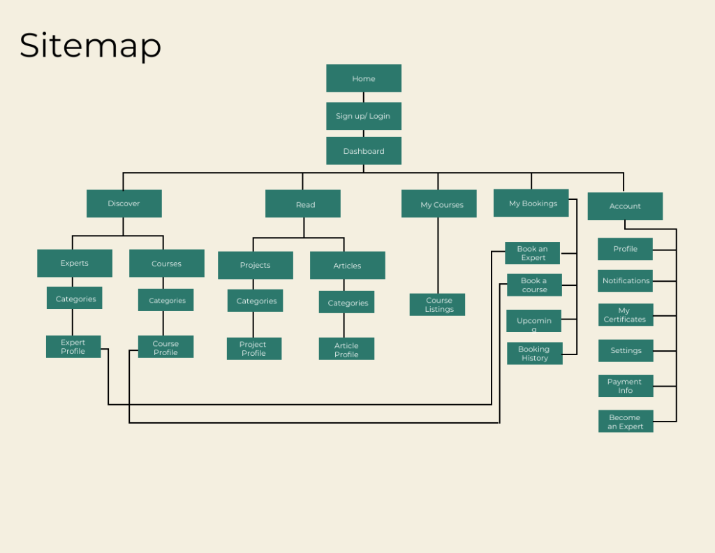
Information Architecture
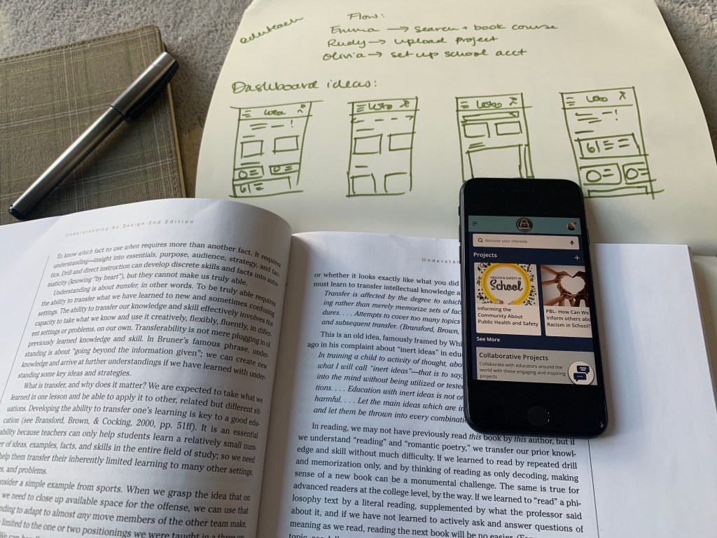
In order to create detailed steps and illustrate complete paths, I needed a starting point and a plan for my user flows. This was to ensure that I could design an effortless and satisfying way for users to achieve their goals. I mapped out three task flows to help me identify the screens my users would access. To make sure that everything for my users ran seamlessly, I created a site map as well as conducted open and closed card sorting via Optimal Workshop.
Beginning The Design
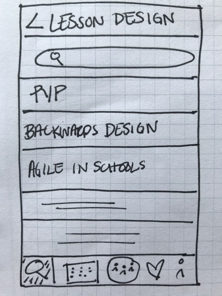
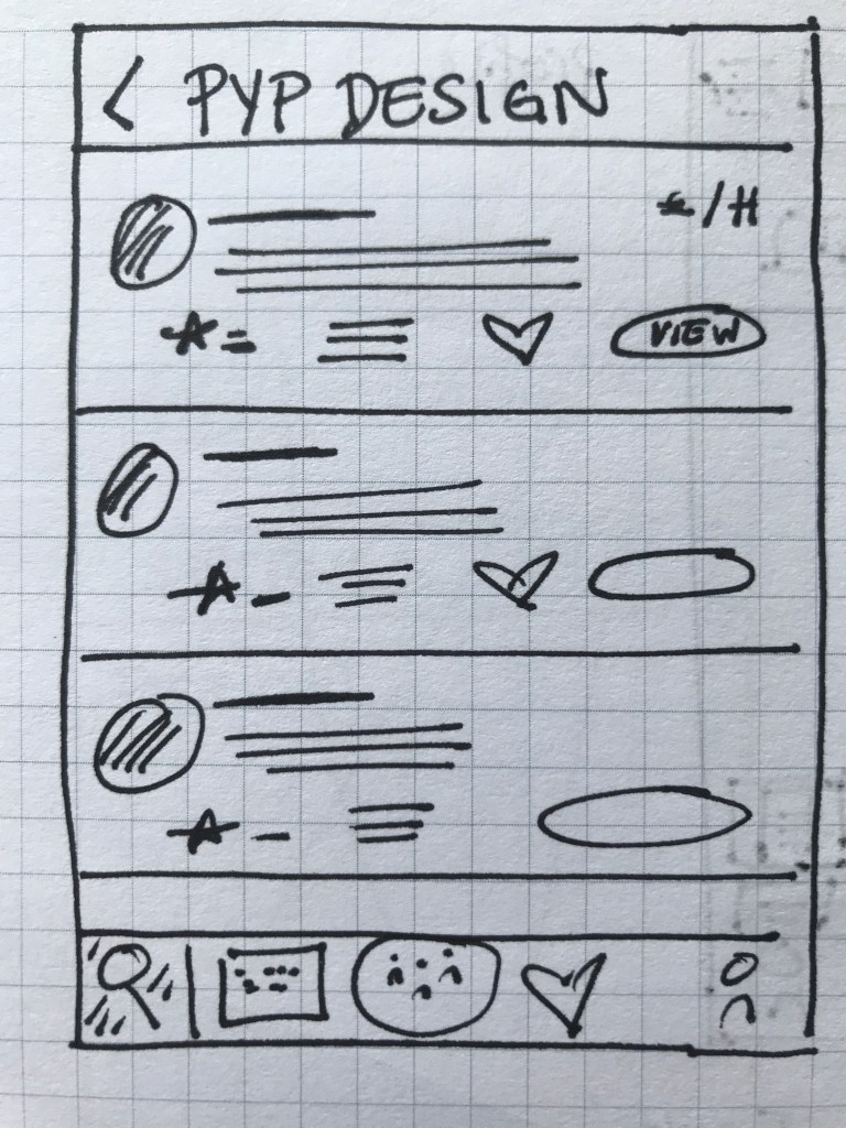
Throughout the design, my wireframes were created in low, mid and hi- fidelity. Low-fidelity wireframes were hand sketched which allowed me to quickly generate ideas and iterate them more easily.
Discover Experts
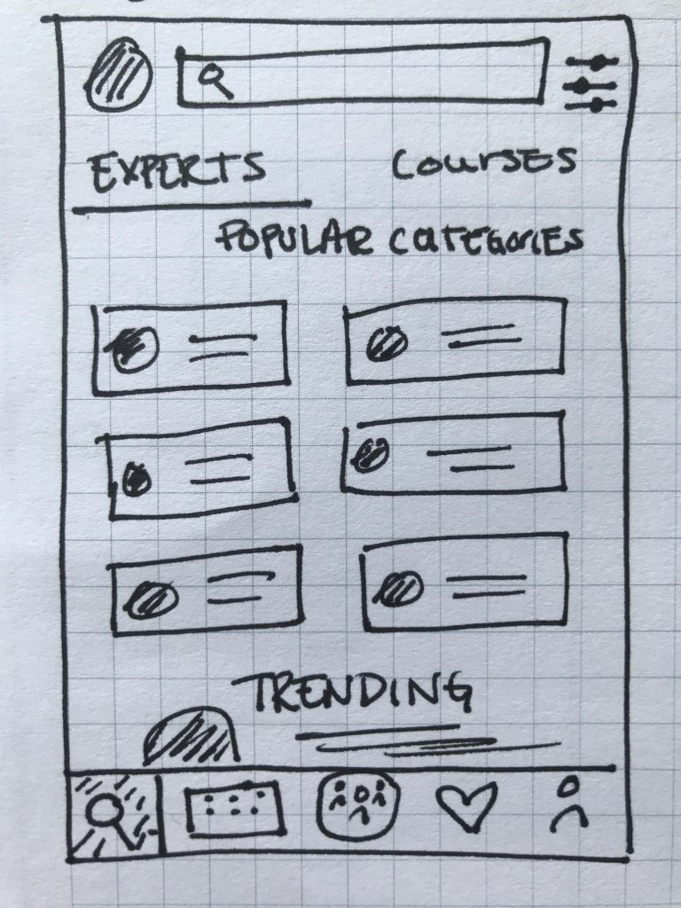
Search Courses
Expert Listings
Expert Details

Booking a Call

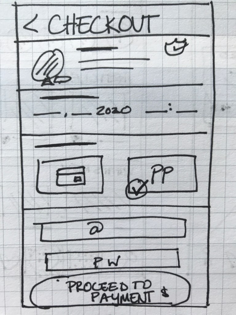
Checkout Screen
With the first low-fidelity sketches came the first feedback from those who interacted with them. This gave me my first learning opportunity on how to improve my prototype. I quickly began gathering ideas of how to improve this prototype. For my mid- and high-fidelity wireframes, I designed the prototype on Adobe XD and Figma.
‘The amount of content seems a bit overboard… especially on such a small screen.’
Quote from Usability Tester
Refining The Design
While not complete, the mid-fidelity wireframes allowed for the app to be more completely represented. The design began to take on a more consistent shape and provided a more transparent representation of the app’s functions.


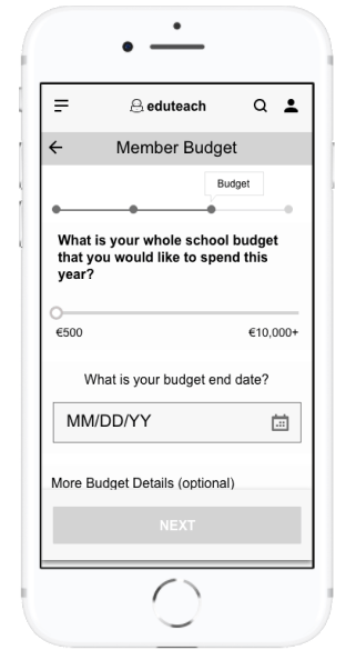
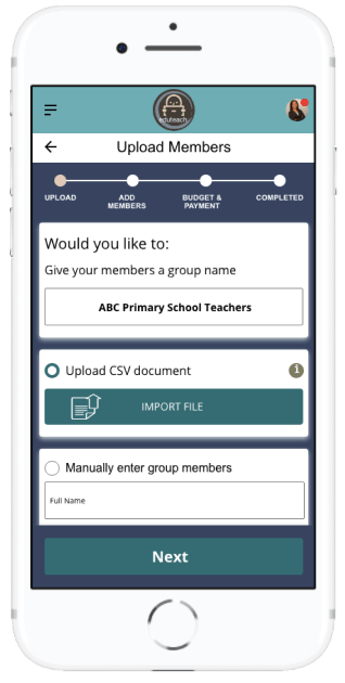
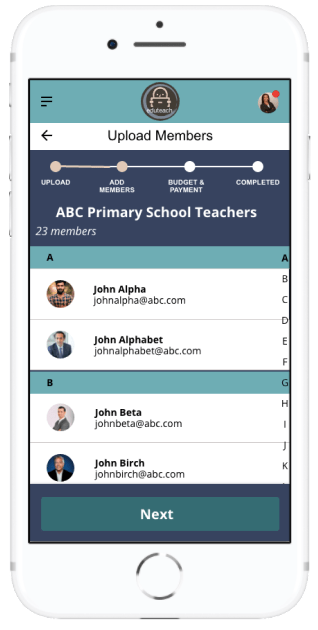
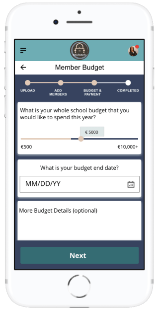
With a more defined prototype, the amount of feedback began to increase. This feedback highlighted some flaws in the design, especially in regards to the user flow. This was most notably seen in the ‘creating a school account’ section. Firstly, when trying to import members into a group. Here it wasn’t clear who should go into a specific group, mostly because the group name came after the members were already imported. Additionally, the process to specifically set a budget for individual members was not as transparent as I thought. I thought more about this and other feedback and decided to add the group name as the first requirement when creating a group in addition to allowing users to set a yearly amount plus an individual amount per person when setting a budget.
‘The budget amount per member is not easily defined.’
Feedback from Usability Tester and Fellow Design Student
Perfecting The Design
Keeping all of this feedback in mind, I began designing the high-fidelity wireframes; first in greyscale and later in colour. Here a lot of change was made in regards to element placement, information architecture and user flow. More specifically, I realised, as my app contains a lot of information and categories, that I needed to find a better way of organising information, which I decided to do through created tabs. I also created more transparency in the process by adding a progress bar to the tasks.
‘It’s not clear how many steps there are.’
Feedback from Usability tester
Finalising The Design
Once the high-fidelity wireframes were in greyscale, I began to run wider usability testing. The goal of my test was to understand the learnability, efficiency, satisfaction and errors of the app for first time users. My test focused on three main functions.
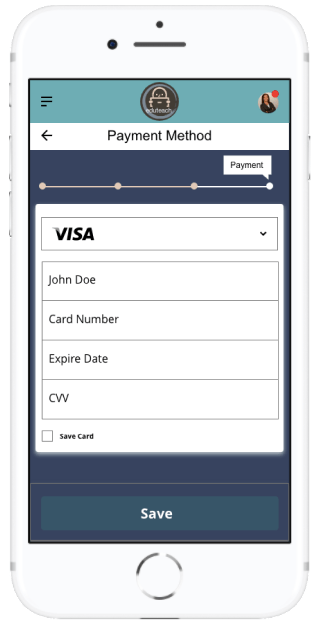
Account Creation:
- How fast can people set up their account?
- Are users wary about entering a payment method to their account?
- What are the most common errors when entering data?
- Does the flow fit with the user?
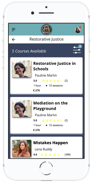
Booking an Expert:
- Will users search and decide on an expert?
- Are there enough filters to help users reach their goal more quickly?
- What are the most common ways a user goes about looking for an expert?
- Can users understand how to use the filters?
- Does the calendar function work well for users?
Uploading Project:
- Do users know where to upload projects?
- What are some missing features when uploading a project?
In person and usability tests were conducted with 6 people both in person and online. After a few background questions, users were asked to complete several tasks on the Eduteach prototype. By observing users facial expressions and body language and analysing the recorded results, I gathered all this information into a rainbow sheet where I could interpret the results and brainstorm the next steps of refining the app
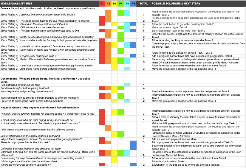
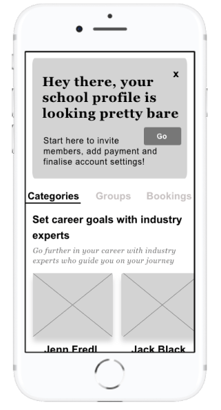
There was a lot of useful feedback that I received and analysed during during the final phase of my usability testing which helped to launch my app into the next phase of the design. One of the most notable things in the design was the CTA button asking users to complete their account. Over half the users failed to see this button in the usability testing. Thus, I decided to add this button as an overlay once the user clicked on the dashboard.
Call To Action Feature
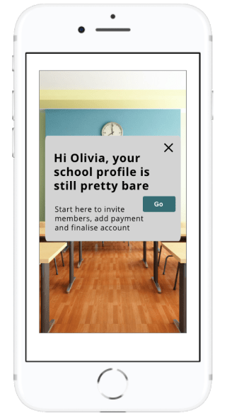
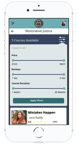
Filters When Searching For Courses
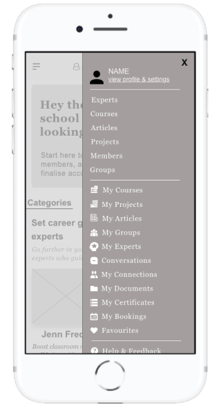
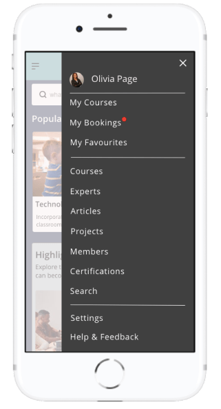
Menu
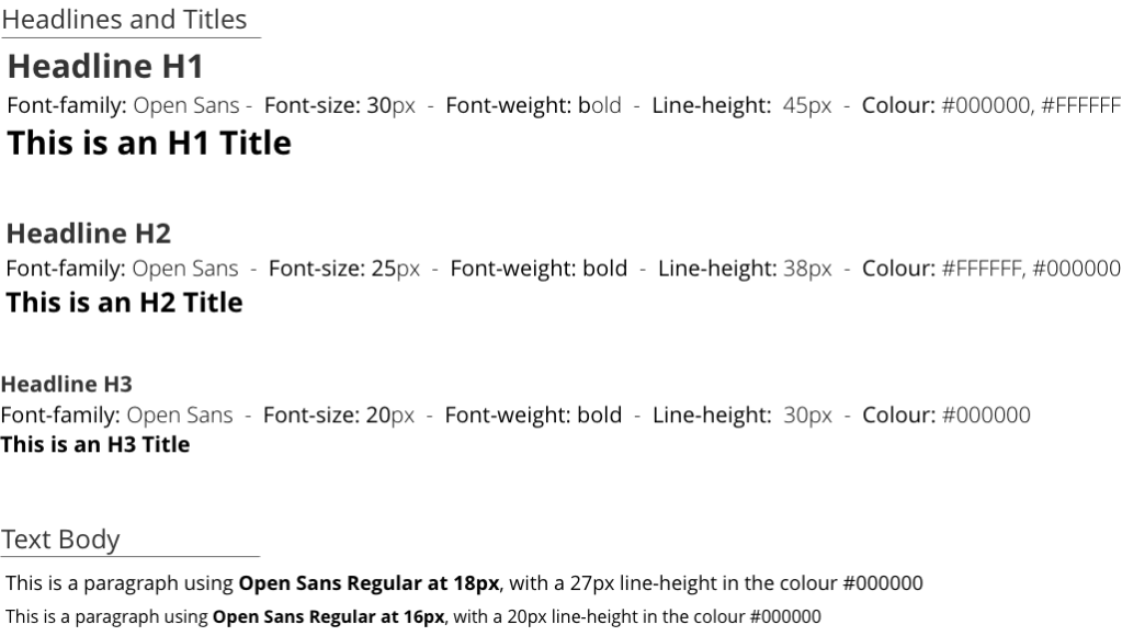
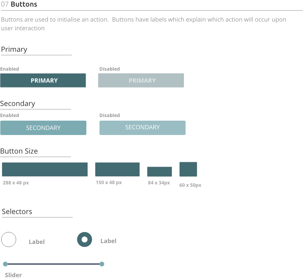
Style Guide
Eduteach is about providing professional development services to educators on the go or for educators who cannot find courses and experts in their local community. The app conveys a level of professionalism but also feelings of familiarity. This was especially important to me when creating my style guide. My goal with Eduteach was to choose the primary color blue, thus evoking a sense of reliability, trustworthiness and communication. Choosing green as a secondary color, indicating growth and vitality. Branding was kept to a minimum with the logo being displayed only in the header. The tone of the app is professional yet familiar and tried to create a comfortable feel for users when booking and speaking with experts.

Final Design
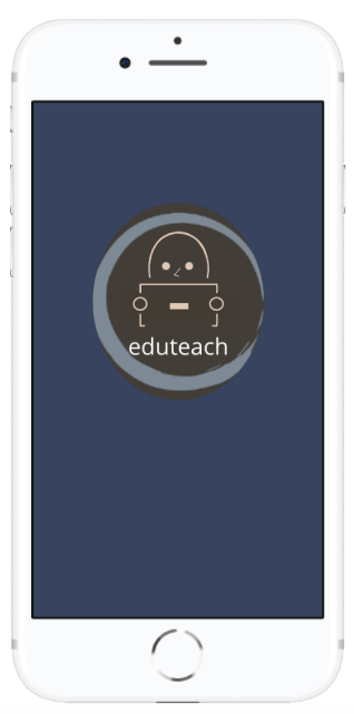
Getting Started
a quick and easy way to login to Eduteach


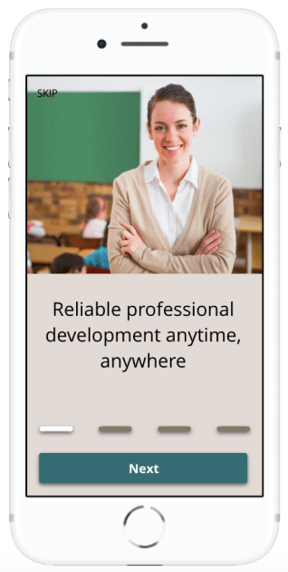
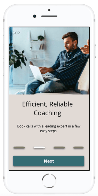
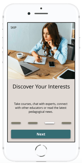
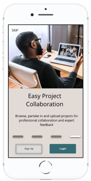
Onboarding
The main overview of the apps functionality
Set Up Group Account
Allow staff members to access professional development through a few easy steps
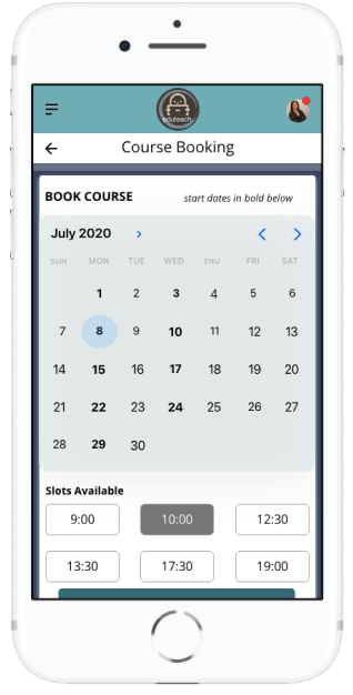
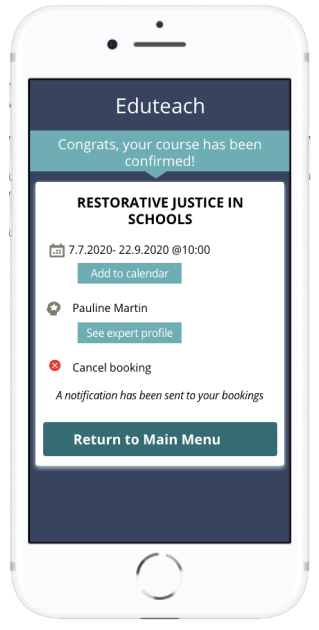
Book a Course
Choose course, select date and time, and confirm


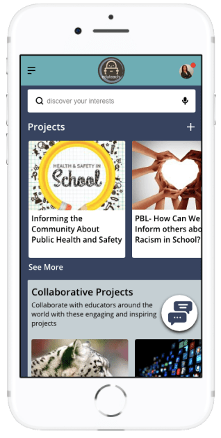
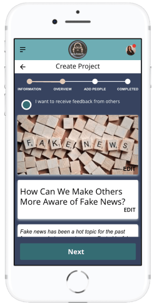
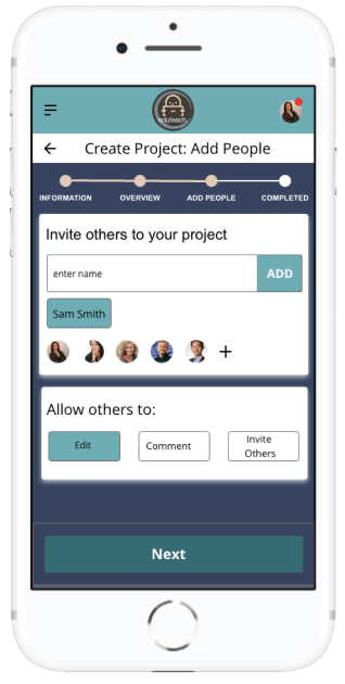
Create and Upload Project
Work on projects together by collaborating with other educators and students
Retrospective
What Went Well
The creation, design and implementation of Eduteach has been a rewarding experience that has given me a design process experience from the initial concept to the final prototype. Although at times challenging, I loved diving deep into this project and learning all the about human-centred design process. In addition to learning about design tools, techniques as well as developer possibilities, I also gained new insight surrounding quantitative research techniques, actively listening and rapid design iterations. Although my design took on many different shapes throughout the process, the focus on user needs remained constant.
I am also pleased with the visual design of this app; the colour palette and images chosen were designed to make the app look professional yet inviting. I also made designing for accessibility a priority more specifically in my design of a chat function for those who have physical impairment where typing may be difficult for them.
What Can I Do Better?
Finding likeminded competitors was difficult for me. I would like to improve on this research next time as well as add a survey for users in this step to help me understand where the competition better lies.
Next Steps
The work of a UX designer is never finished, which is why I find this type of work especially appealing. Even as my prototype was in its final stages for this project, user feedback had me thinking about the next steps. Going forward, I would have re-designed the filter buttons and options, as this was an area testers spoke about often. By focusing on this aspect during another round of user testing, I could gage how users respond to and interact with this feature. I would also like to further my responsive website by designing a version that is compatible with a tablet.
